
Chariots of color 2012
A typographic experiment inspired by the London 2012 Olympiad.
2012 belongs to London. The capital of England will host the games of the XXX Olympiad. There is a lot of criticism around the London 2012 visual identity. I'm not a real fan of the logo but I really think the rest of the visual identity is interesting and fresh. I think it suits a city that has never played safe on the design front.
London based designers have broken the rules many times in the history of visual communication and have expressed new and revolutionary messages. There are three movements born in London that I am particularly attached to: The Arts & Crafts at the end of the 19th century, the Punk - New Wave and the Techno - Rave culture at the end of the 20th century. All of them have influenced my work in so many ways. The Arts & Crafts pattern masters are a constant point of reference in all my pattern and mosaic related work.
Punk and New Wave design was the first movement I followed when I was in college.
And Rave culture has been the first internet-centric mass culture and the one that helped digital artists communicate with the masses.
So this is the result of some experimentation on the London 2012 subject during the last 3 months. From the official identity I have kept only the color palette. I found that the fluorescent colors were the natural continuation of the punk rock cover art of Jamie Reid but also the main hues of the rave culture.
Unlike the punk or rave tradition I have experimented with only one typeface. I used the PF DIN a typeface that is mostly related to Germany than England. This isn't some kind of humor on the Germanization of Europe. :-) I really think that it suits to industrial spirit I wanted to give these experiments.
So here are the illustrations:
Let the party begin!
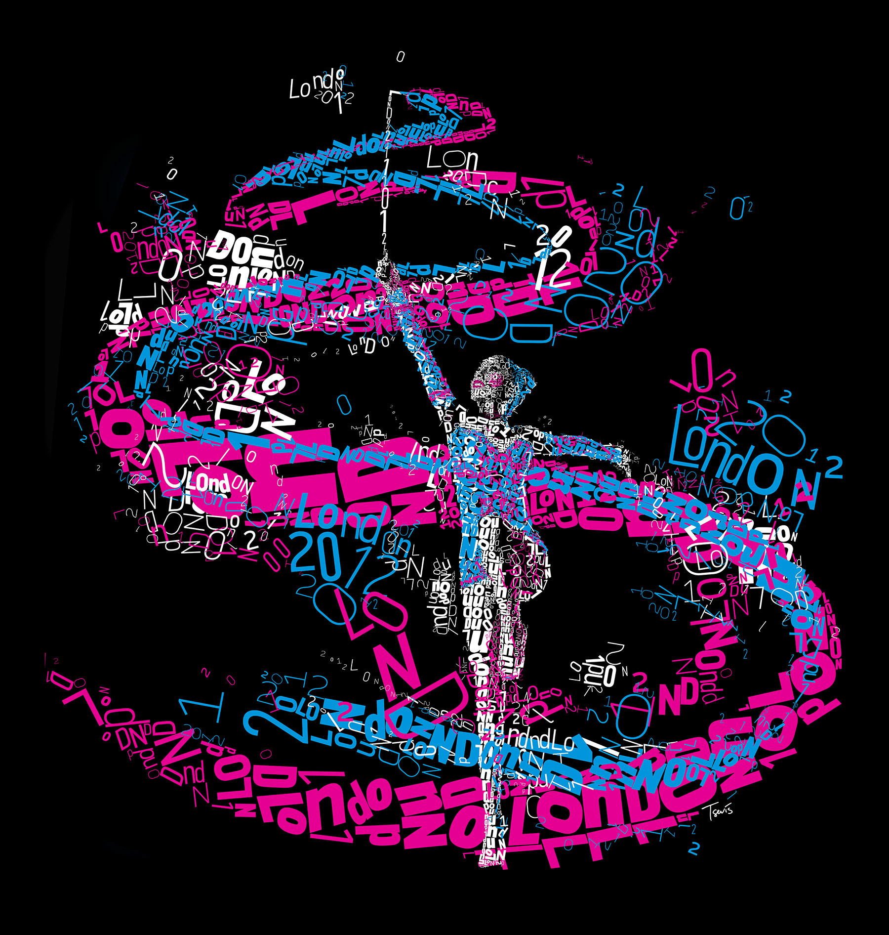
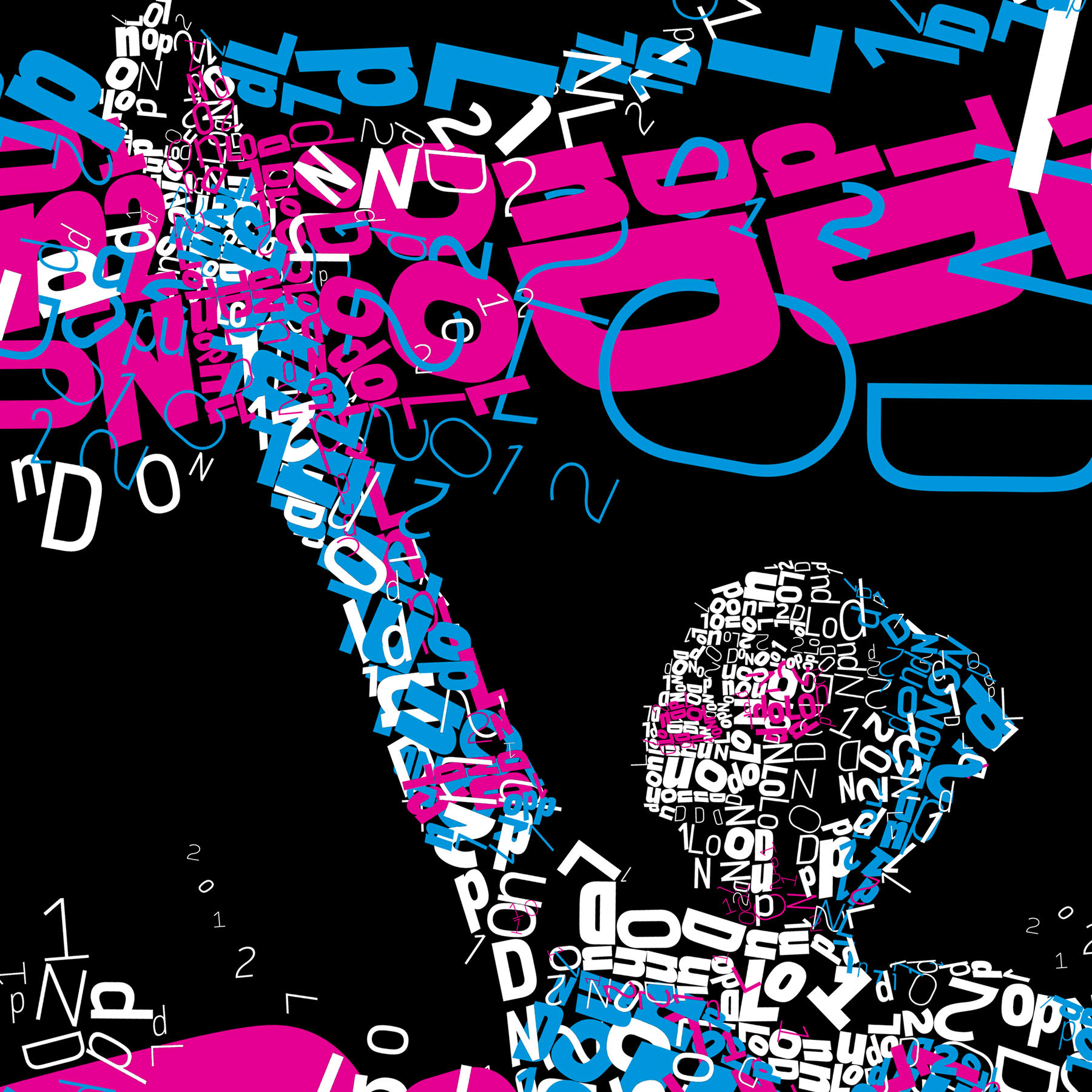
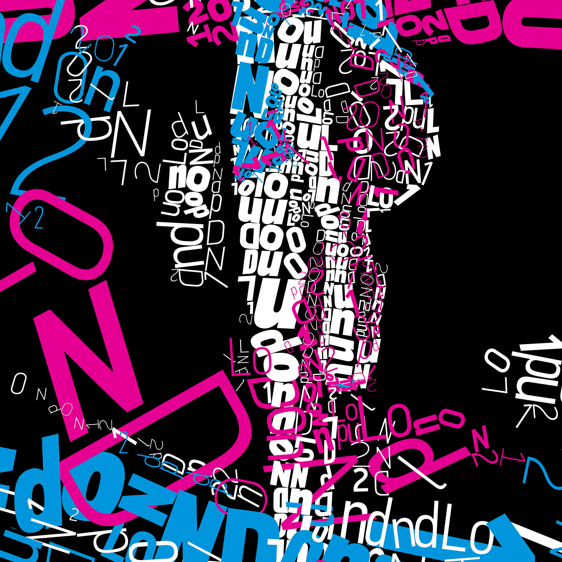
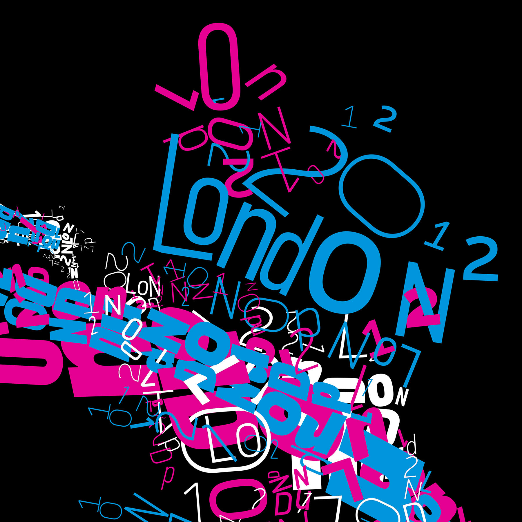
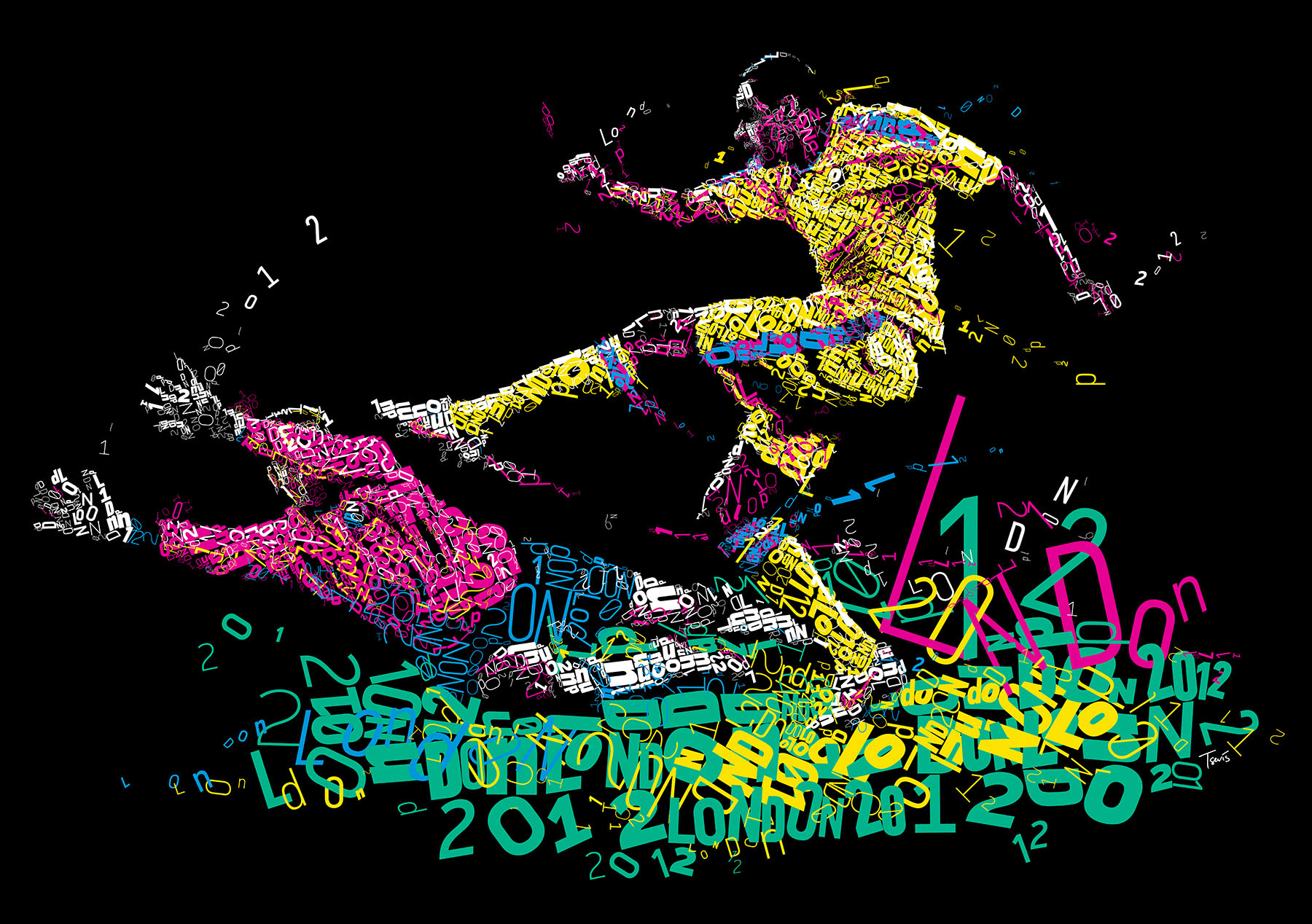
Gymnastics and the opening ceremony!
Gymnastics and the opening ceremony!
This is the first illustration I created. I used only 2 of the main colors of the visual identity, the magenta and light blue. I wanted to transmit the happy feelings of celebration of the opening ceremony.
Let the party begin!
The final file is 9984 x 10496 pixels (33.3" x 35.0" @ 300 ppi).
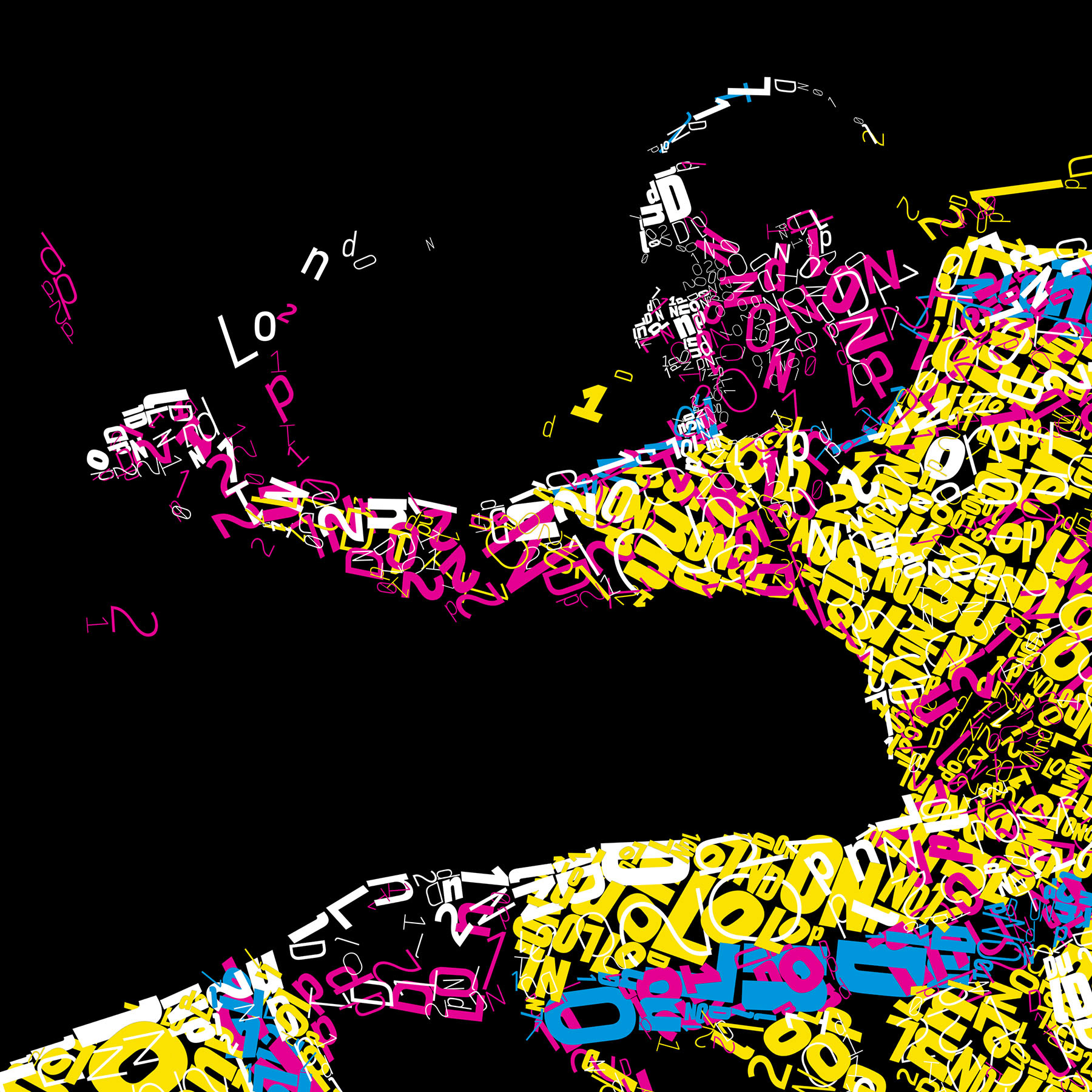
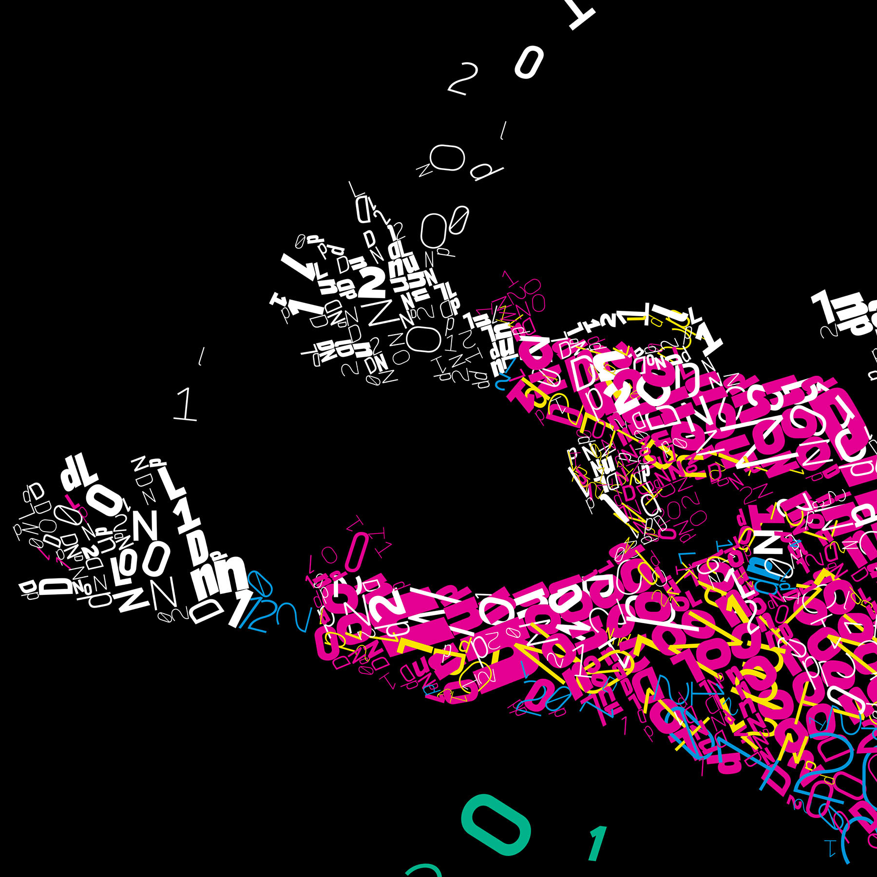
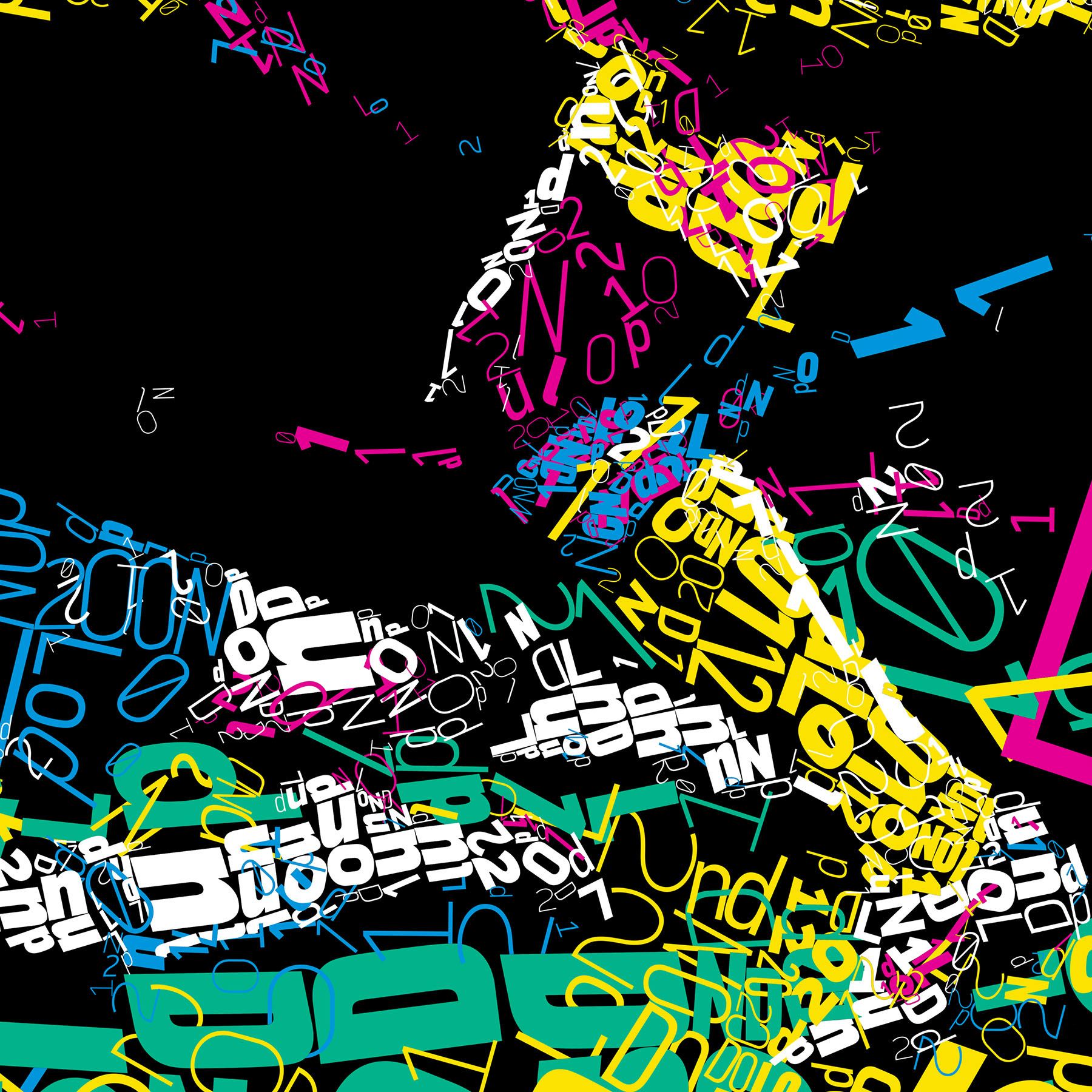
You can see some details bellow.
Alternatively you can zoom in to the high res (91 megapixels) file with Microsoft ZoomIt by clicking here.
Back to where it all started!
Soccer returns to its birth place.
Soccer returns to its birth place.
The second illustration created was about soccer. The very early origins of football can be found in China, as almost any other invention on the planet. But the current form of the game is surely from England.
For this illustration I have used more aggressive, more punk rock forms.
For this illustration I have used more aggressive, more punk rock forms.
Back to where it all started!
The final file is 11264 x 7936 pixels (37.5" x 26.5" @ 300 ppi)
You can see some details bellow.
Alternatively you can zoom in to the high res (89 magapixels) file with Microsoft ZoomIt by clicking here.
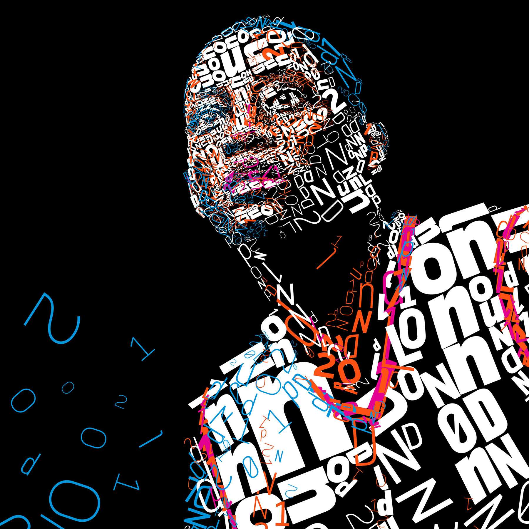
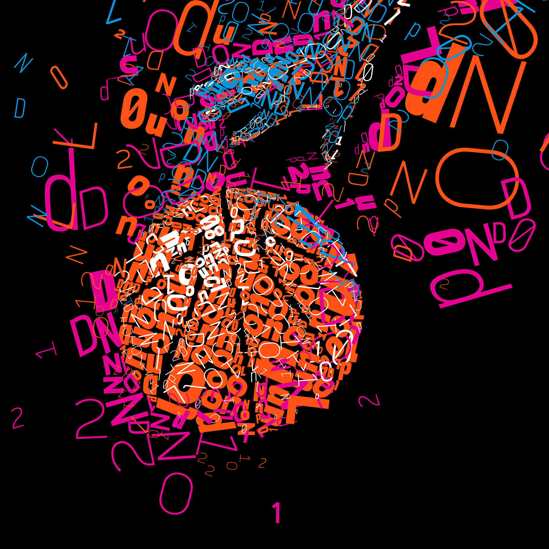
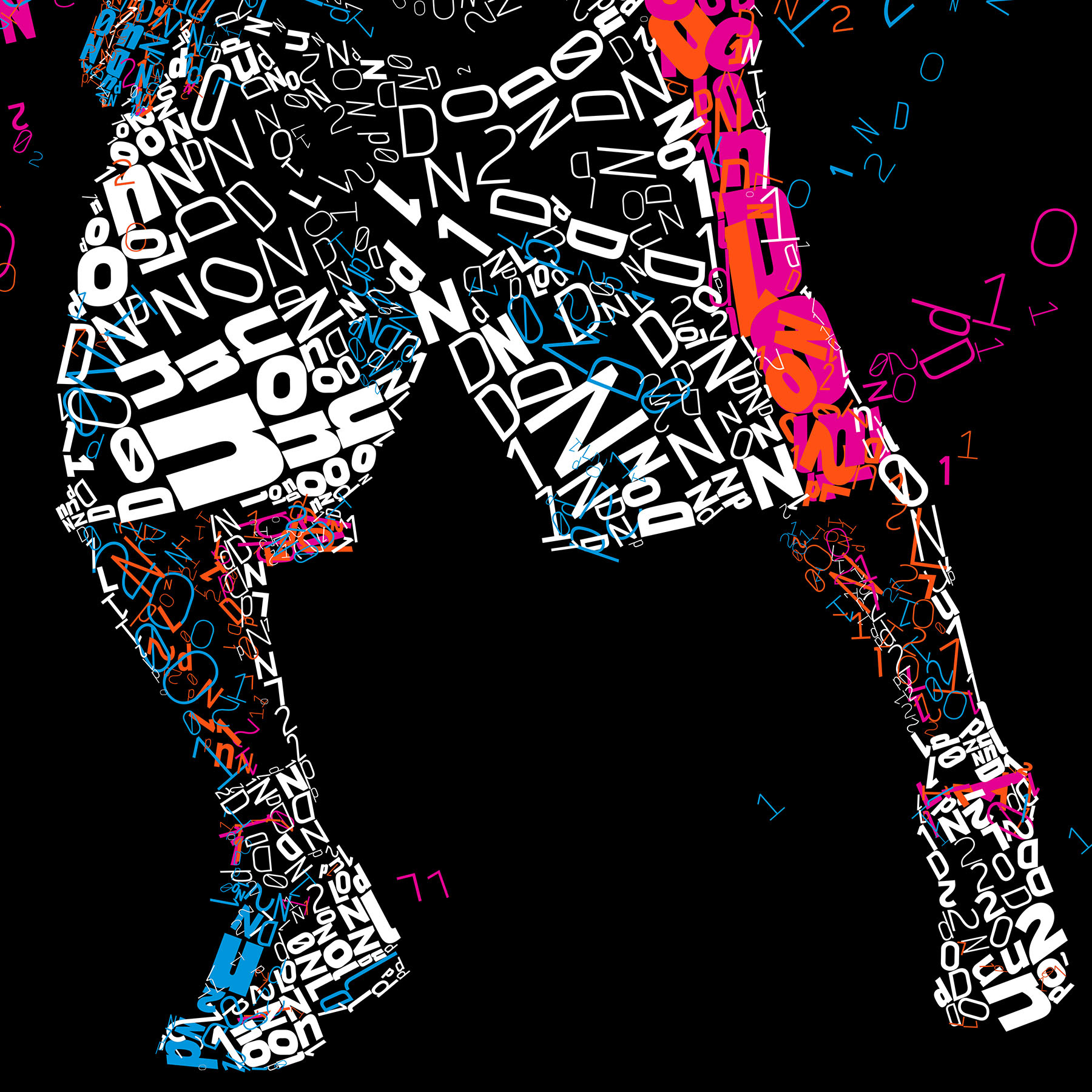
Dream city
The third illustration is about Basketball. Talking about Basketball and the Olympics we cannot help but think of the original USA Dream Team of the 1992 Barcelona Olympiad. This is why I have chosen an African American athlete for this illustration as a reminder of that time. Red white and blue colors have been chosen for obvious reasons.
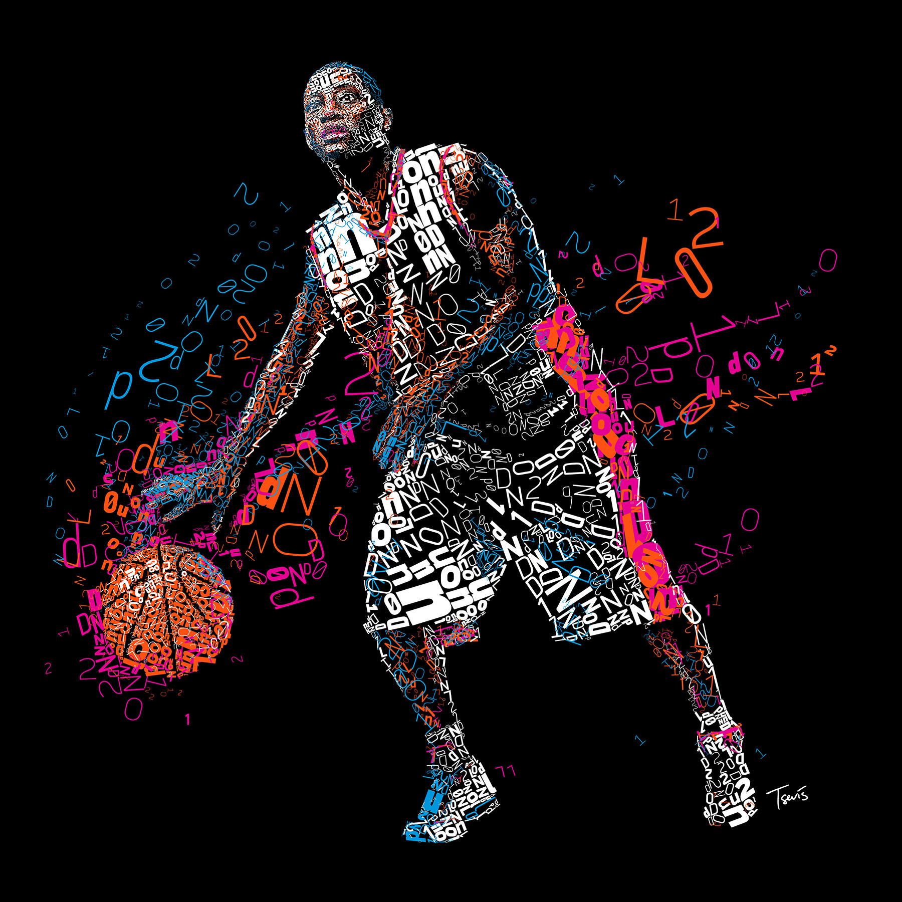
The final file is 10240 x 10240 pixels (34.1" x 34.1" @ 300 ppi)
You can see some details bellow.
Alternatively you can zoom in to the high res (104 magapixels) file with Microsoft ZoomIt by clicking here.
Reaching new heights!
Soccer or Basketball are great but Athletics is the king of any Olympiad. These sports are closer to the noble spirit of the original Olympic games as they have been introduced to the world by the Greeks and later by the Romans. I have chosen two of the most popular sports for my experiments. Long jump was one of them.
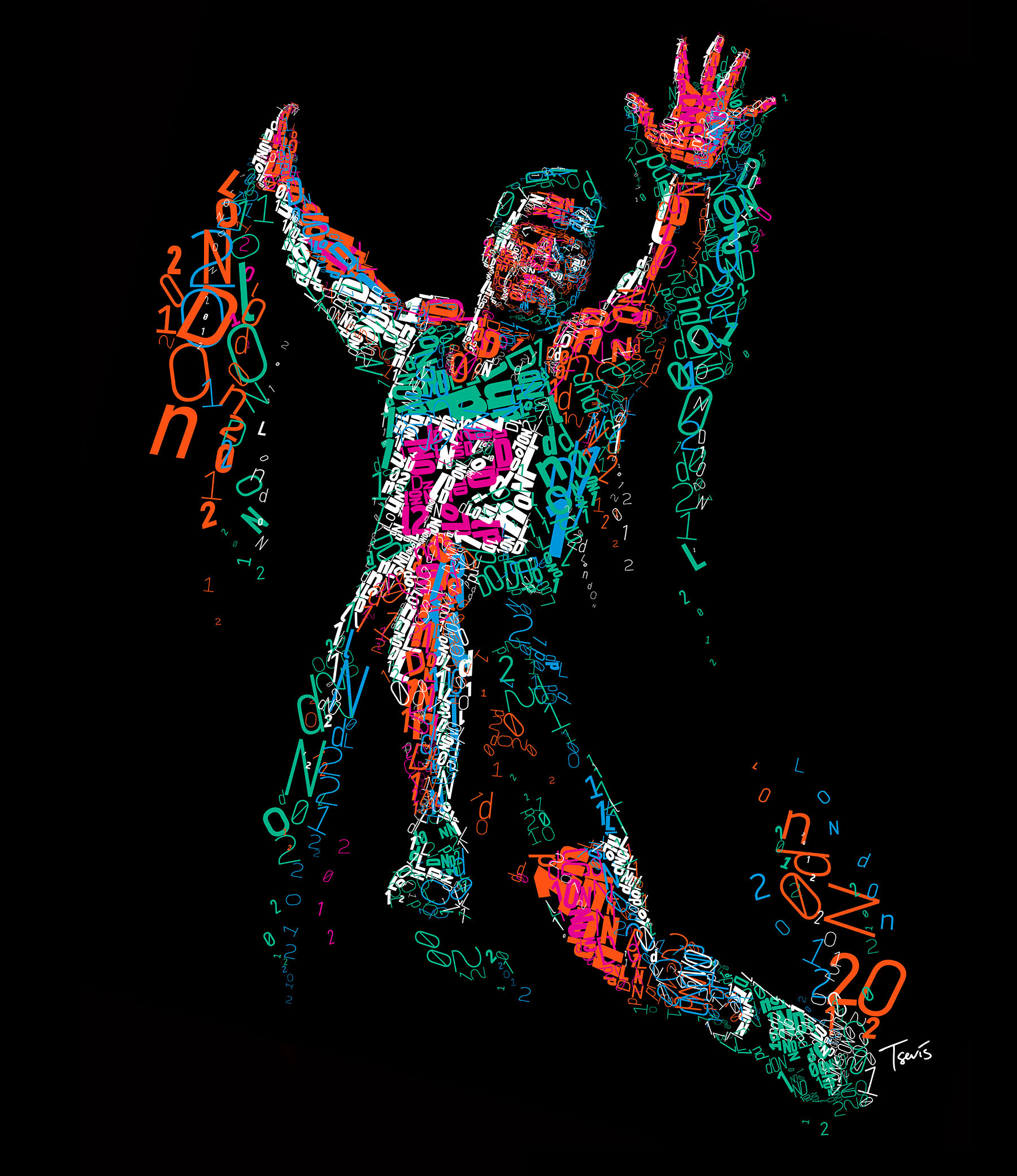
The final file is 8192 x 9472 pixels (27.3" x 31.6" @ 300 ppi)
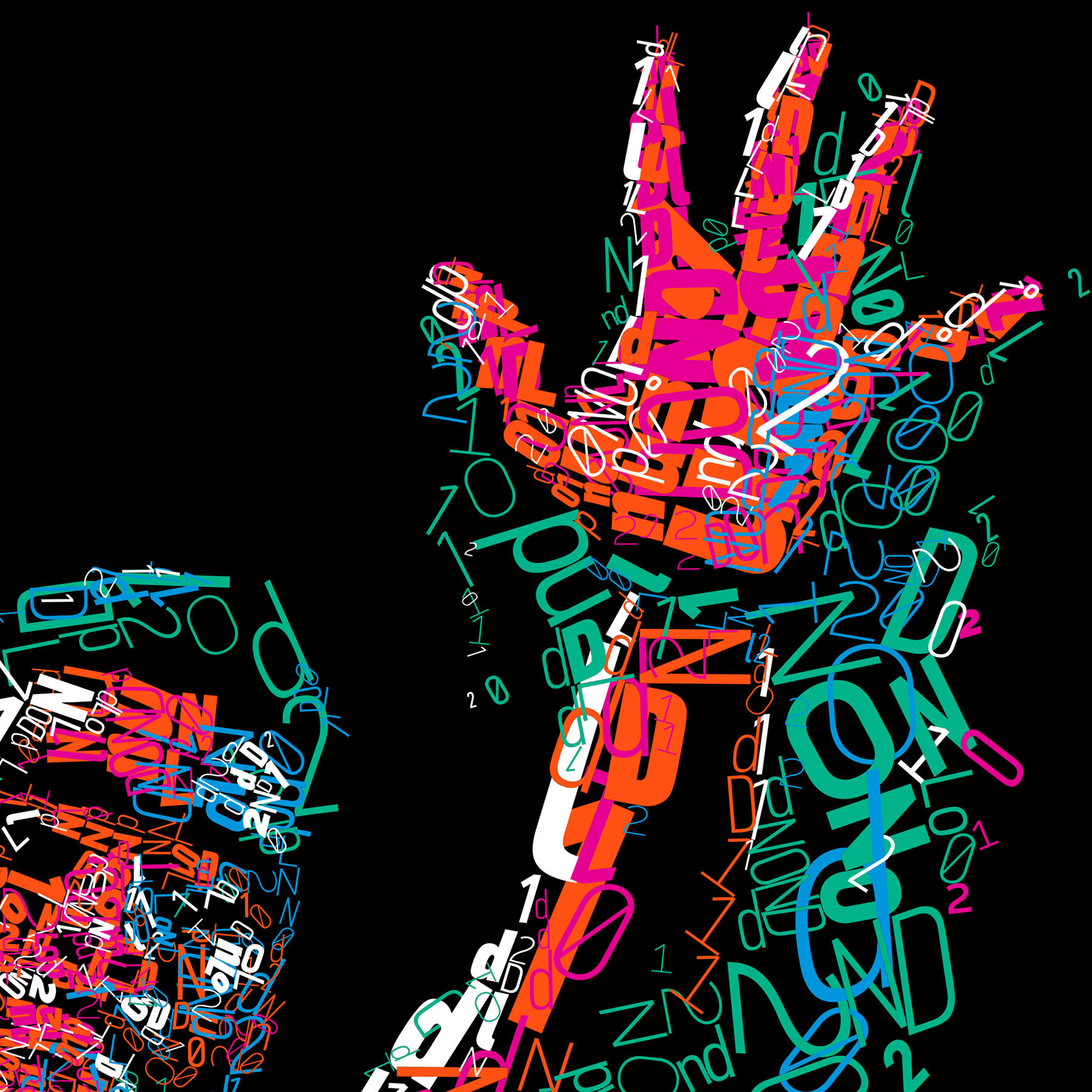
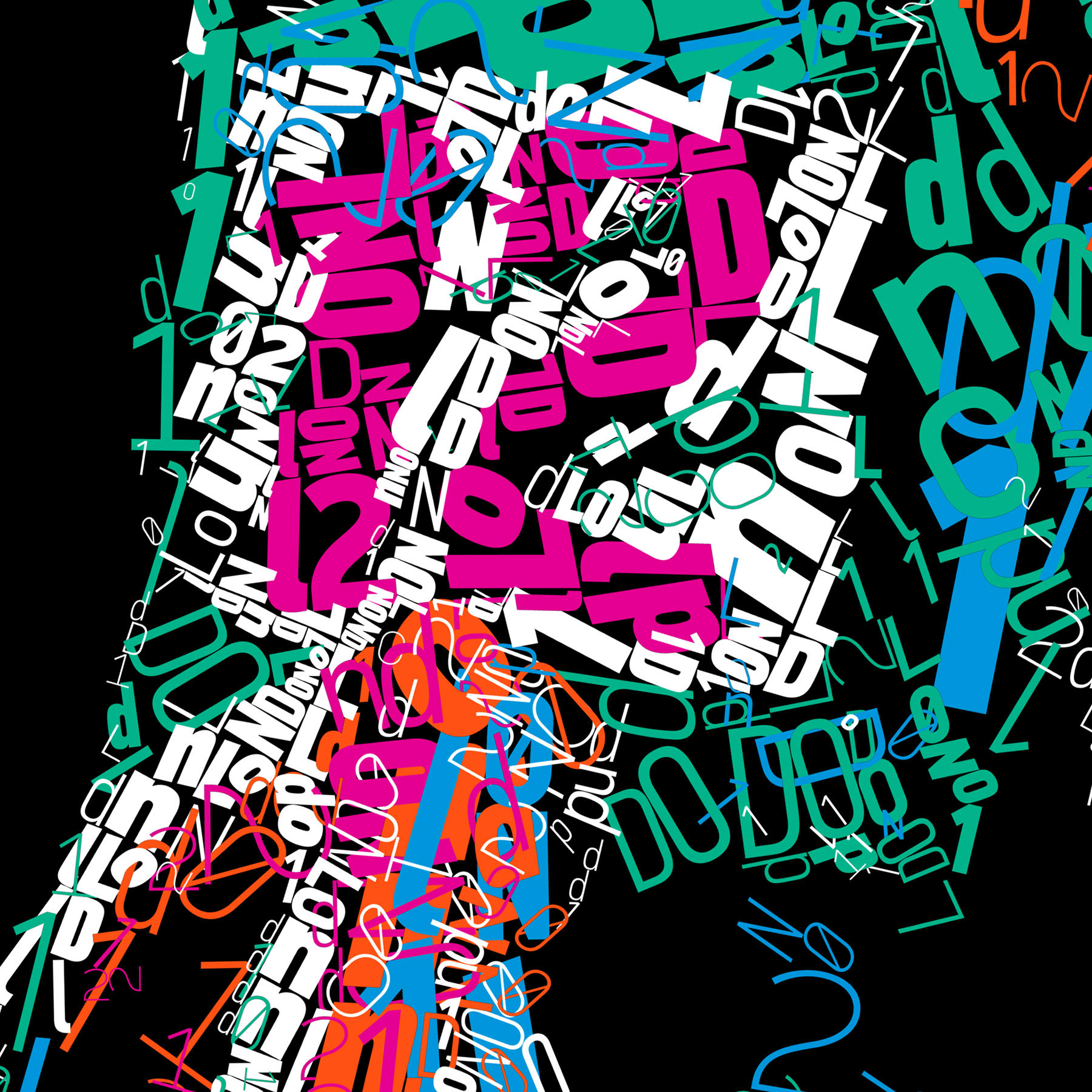
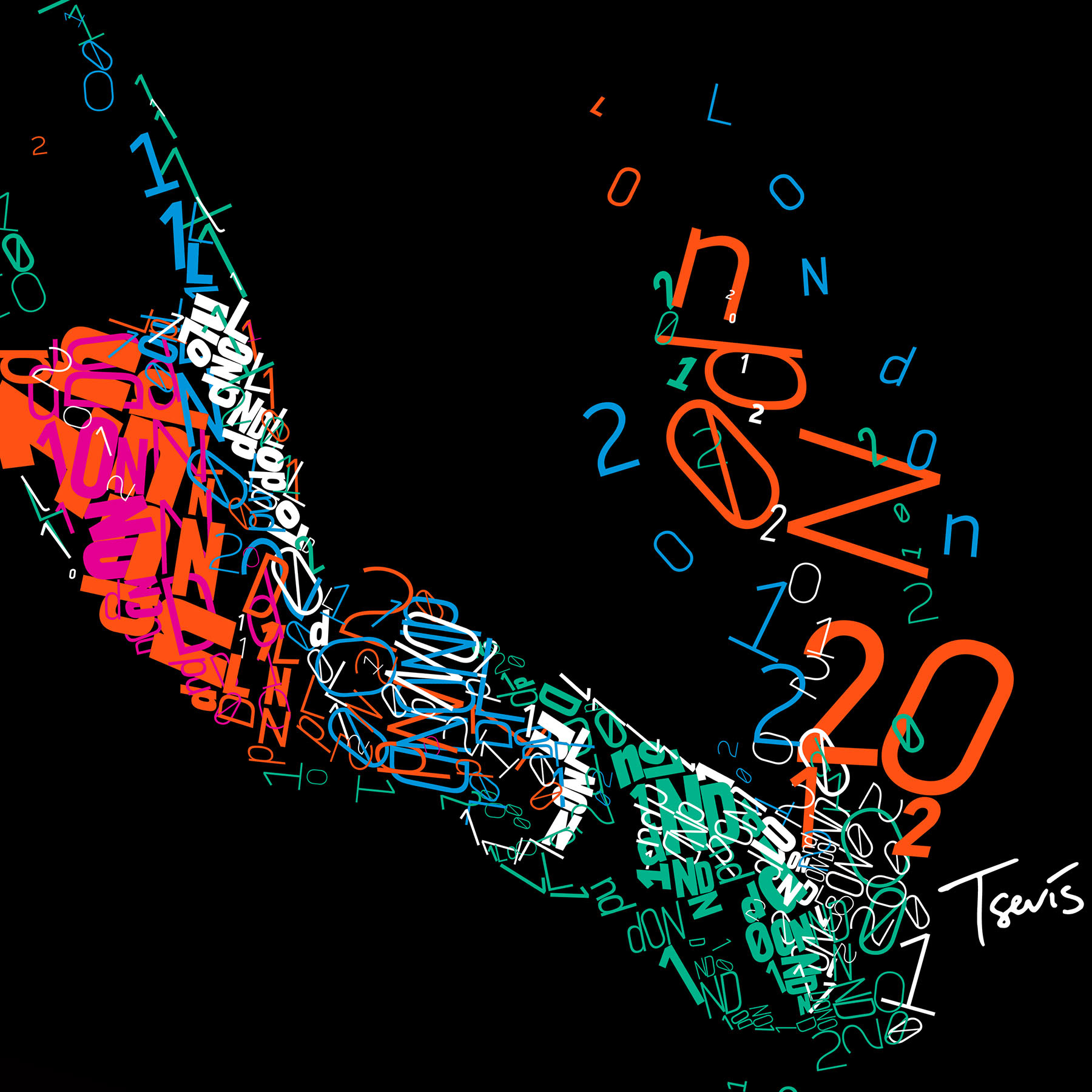
You can see some details bellow.
Alternatively you can zoom in to the high res (77.5 magapixels) file with Microsoft ZoomIt by clicking here.
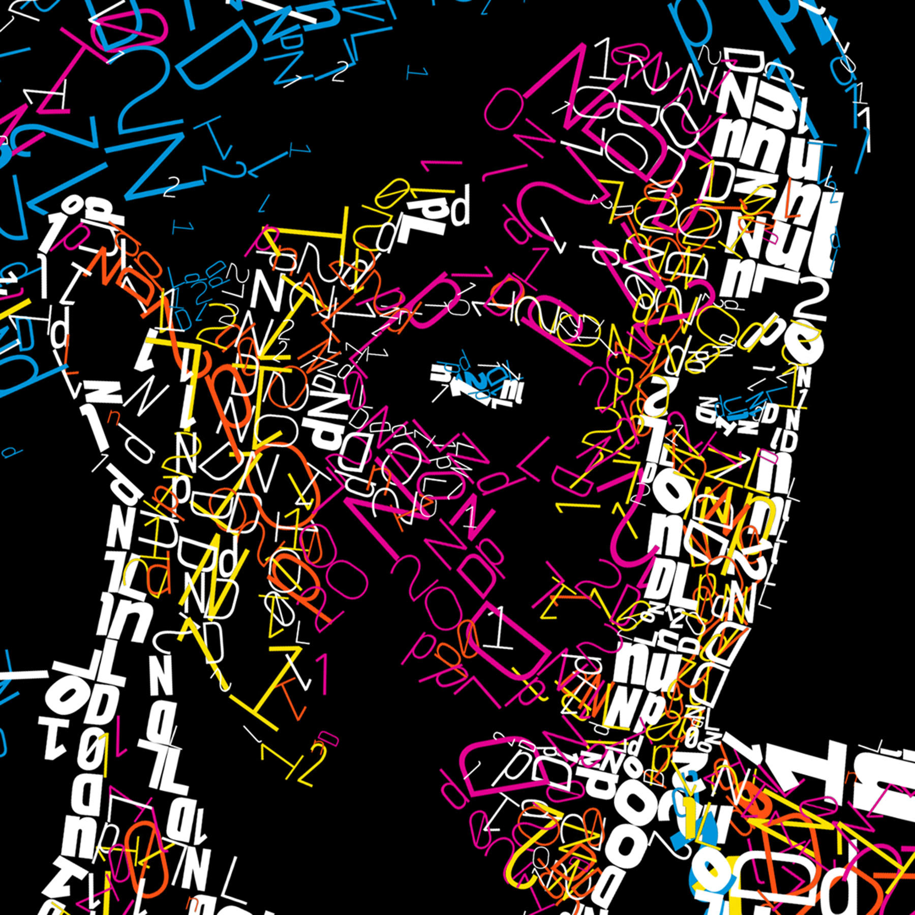
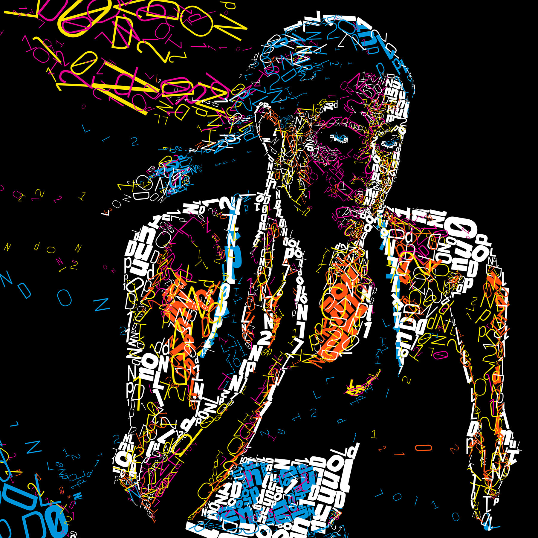
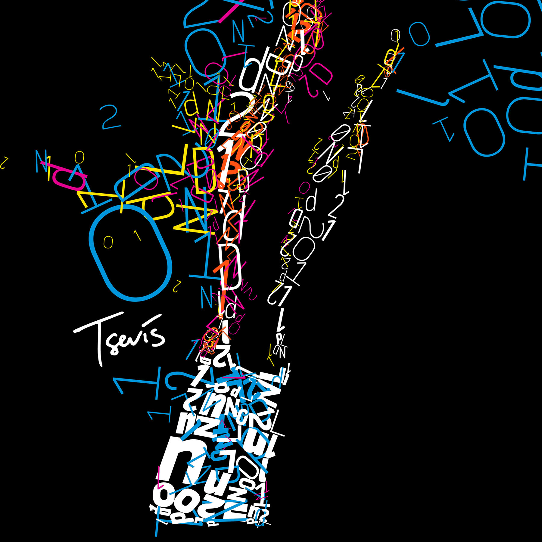
Chariots of color
Running for the gold and for the honor...
Running for the gold and for the honor...
Do you remember the Chariots of Fire movie? The two Brit athletes running for gold, honor and against discrimination while the wonderful music of my compatriot Vangelis was playing? Creating graphics for the Olympics cannot be complete without a runner. This is my version of the chariots of colors... I have chosen the Cuban born Italian athlete Libania Grenot to tell a modern story about gold, honor and discrimination.
Hope you like it.
Hope you like it.
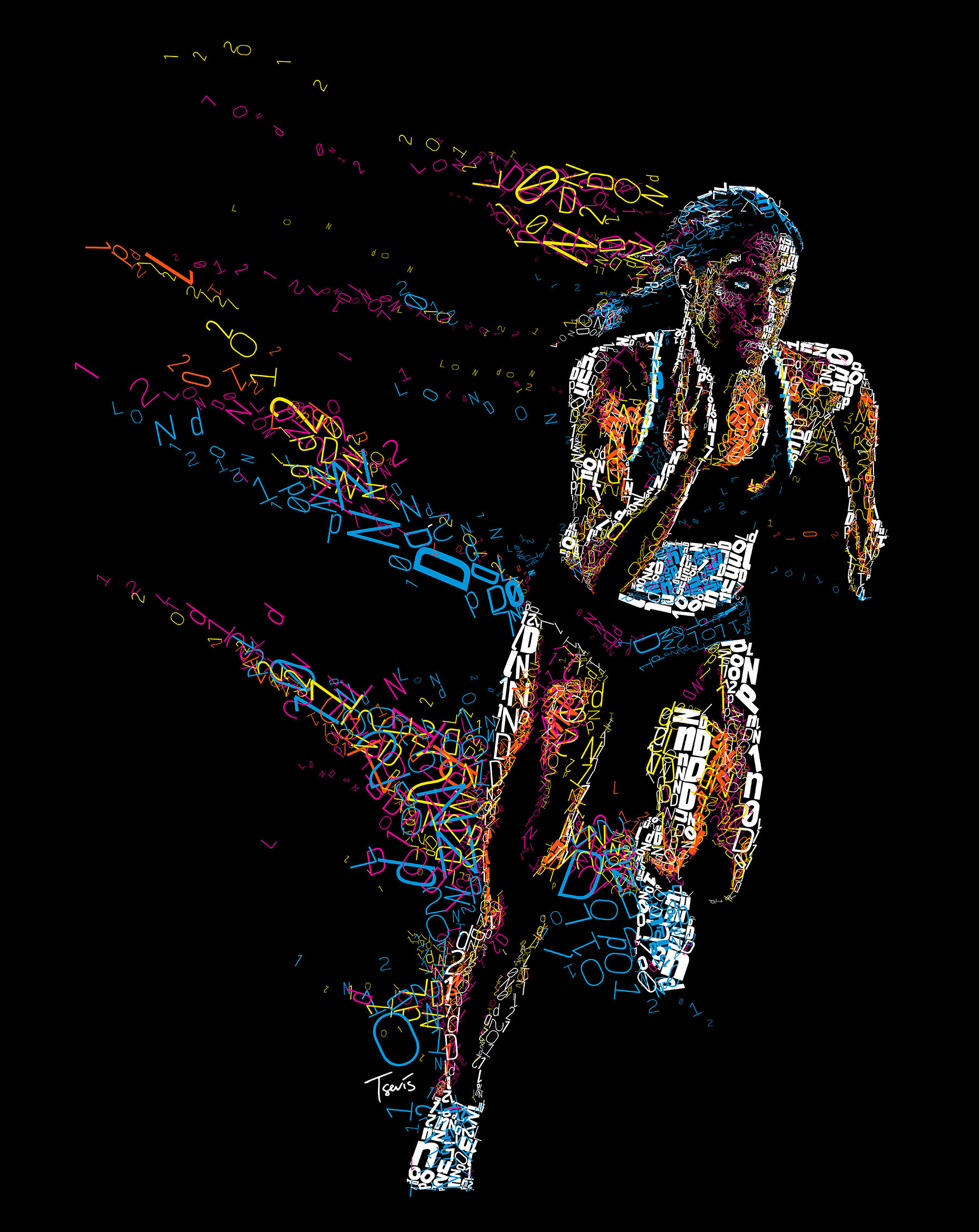
The final file is 7936 x 9984 pixels (26.5" x 33.3" @ 300 ppi)
You can see some details bellow.
Alternatively you can zoom in to the high res (79 magapixels) file with Microsoft ZoomIt by clicking here.
Credits:
Art direction and illustration by Charis Tsevis
Software used: Synthetik Studio Artist, Adobe Creative Suite, Apple QuickTime Pro with custom developed scripts and hacks.
Typeface used is PF DIN Pro designed by Panos Vassiliou @ Parachute Fonts.
Partially based on photographs by Guryanov Andrey Vladimirovich, Iurii Osadchi, Olly, Sportgraphic and Diego Barbieri downloaded from Shutterstock.
Special thanks to Dimitra Tzanos and Panos Vassiliou.