
Why a Mosaic Works
Perception, Gestalt and Distance
A mosaic works because we see the whole before we see the parts. The eye groups separate pieces into forms, it needs surprisingly little information to find a face, and distance does the rest. This page is about what happens in the viewer, and about why a mosaic whose pieces change in size reads differently from one whose pieces do not.
The whole before the parts
In 1923 the psychologist Max Wertheimer described the laws by which the eye groups separate elements into forms, among them proximity, similarity and continuity.1 With Kurt Koffka and Wolfgang Köhler he founded what became Gestalt psychology. Its central claim is that a whole is not simply the sum of its parts: it is something other than them.
A mosaic is that claim made by hand. Each law has its own work to do in it:
- Proximity. Pieces set close together are seen as belonging together. The narrower the joints, the sooner the tesserae merge into areas of tone.
- Similarity. Pieces of similar colour or brightness group into regions, and the regions become a cheek, a sky, a robe.
- Continuity. The eye follows a line of pieces as one line. This is why the rows of a mosaic, its andamento, can draw a contour without any drawn line.
In 1977 David Navon showed that people recognise a large letter made of small letters faster than they recognise the small letters themselves, and that the large letter interferes with reading the small ones more than the other way round.2 He called it global precedence. Every mosaic is a version of Navon’s figure: a large image made of small ones, read from the top down.
Gestalt psychology gave these effects a vocabulary in the twentieth century. Mosaic makers had been working with them for millennia.
How little a face needs
In 1973 Leon Harmon of Bell Labs reduced a photograph of Abraham Lincoln to a few hundred grey blocks and showed that it could still be recognised.3 In the same year, with Bela Julesz, he showed something stranger: the blocky portrait becomes easier to recognise when it is blurred.4 The sharp edges of the blocks add fine detail that has nothing to do with the face, and that detail masks the coarse information the face is carried by. Blur it, step back or narrow your eyes, and the face returns.
This is the mosaicist’s daily experience, measured in a laboratory. Seen from close, the edges of the tesserae are information about the pieces. Seen from far, the same edges are noise at the scale of the figure, and the eye discards them. Both readings are true at once, at different distances. Harmon had already worked on this question with Kenneth Knowlton: their mosaic of 1967 was called, precisely, Studies in Perception I.5
Decades later we made our own Lincoln, for a Smithsonian special edition on “The 100 Most Significant Americans of All Time”. The face that Harmon reduced to blocks is built here from the faces of the hundred Americans the issue named, and it holds for the same reason his did: the eye needs only the coarse structure of a face to find it.
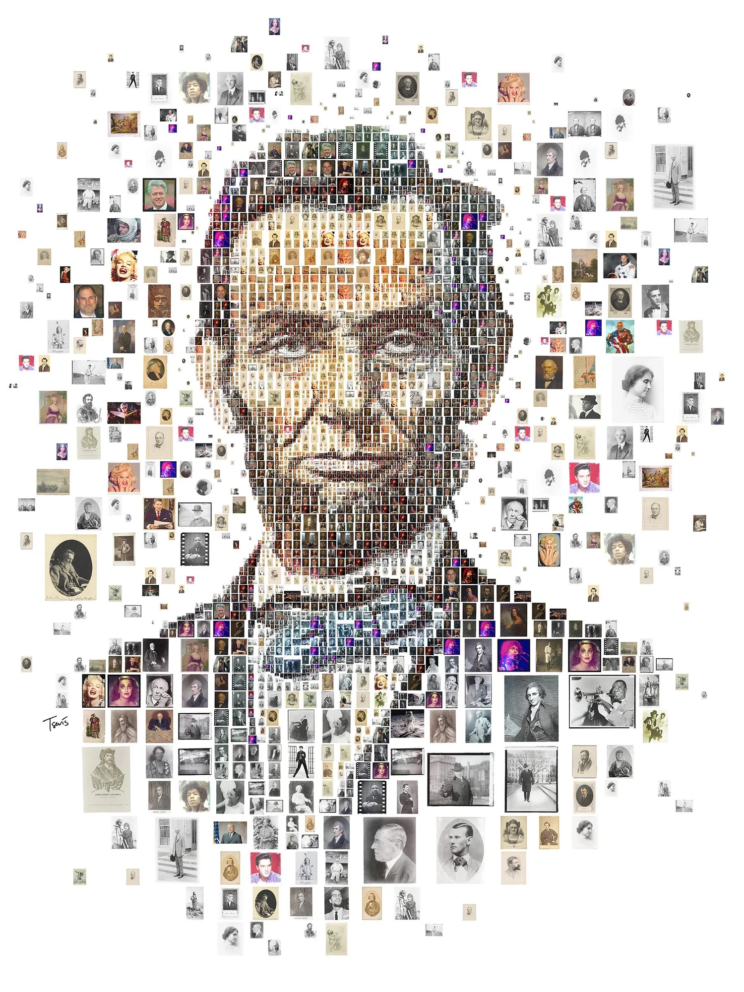
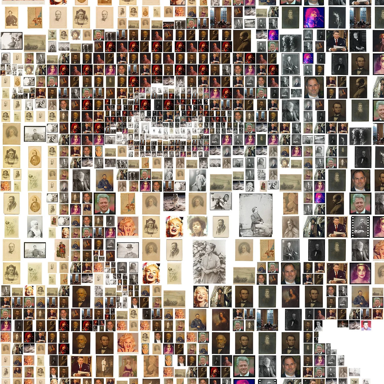
Faces have a special place in this. In 1997 Nancy Kanwisher, Josh McDermott and Marvin Chun identified a region of the human brain, the fusiform face area, that responds more strongly to faces than to other objects.6 We find faces quickly and surely, even in clouds, sockets and fragments. That is why a portrait can take so much disruption and still hold, and why it is a demanding test of a mosaic: the eye forgives nothing in a face, and it finds one almost anywhere.
Painters knew this long before the laboratory. At the Habsburg court in the sixteenth century, Giuseppe Arcimboldo painted heads made of fruit, flowers, books and fish. In Vertumnus, of about 1590, the emperor Rudolf II is a harvest of fruit and vegetables.7 The face appears at once, and only then the objects it is made of. A mosaic of images works in the same order: first the portrait, then the pieces, then the question of why these pieces.
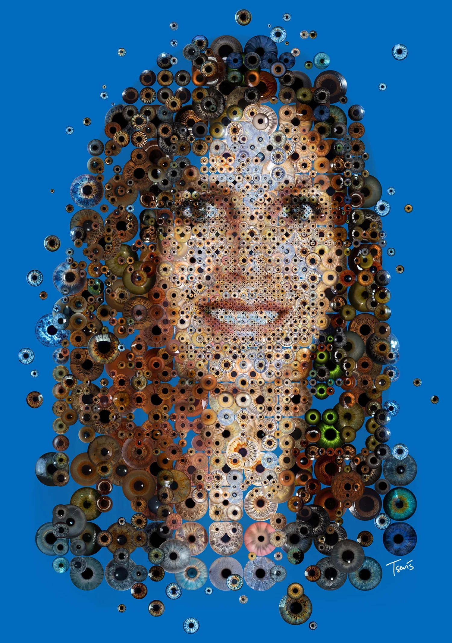
Figure and ground
In 1915 the Danish psychologist Edgar Rubin described how the eye divides a picture into figure and ground: one region is seen as a thing, the other as the space behind it, and in an ambiguous picture the two can change places, as in his well-known drawing that is both a vase and two faces.8
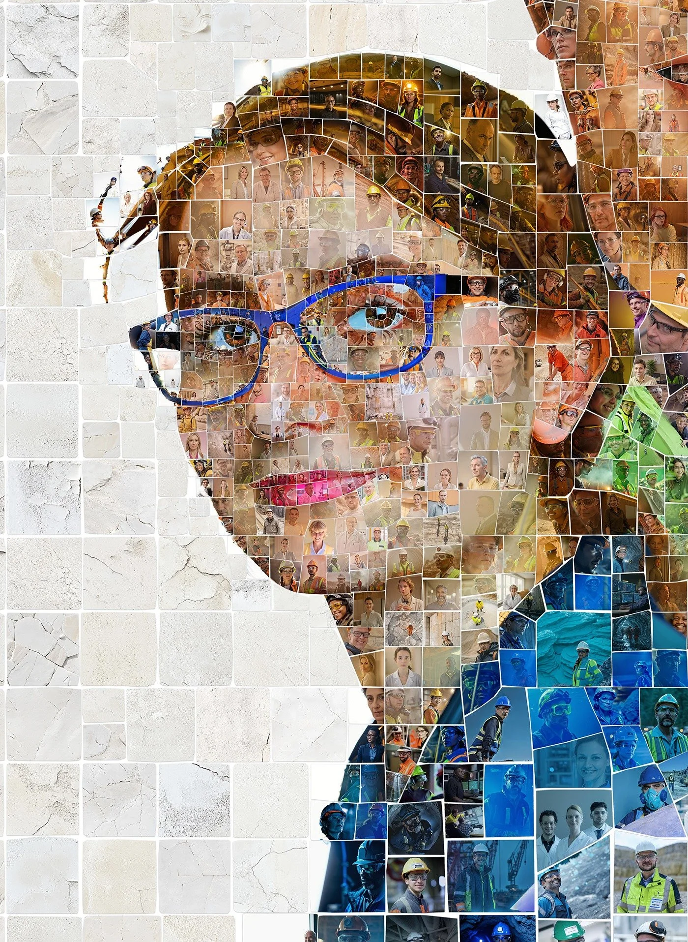
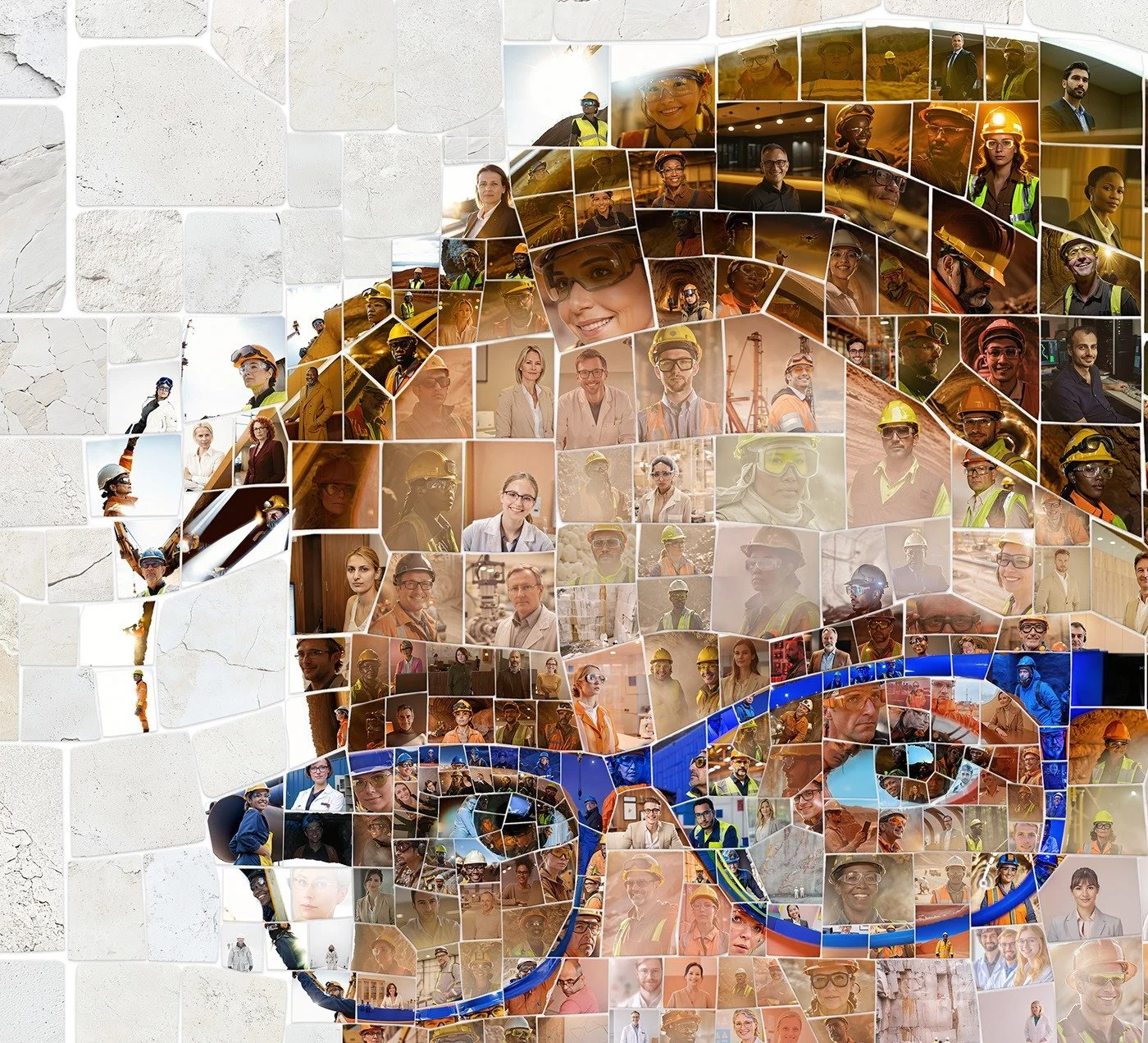
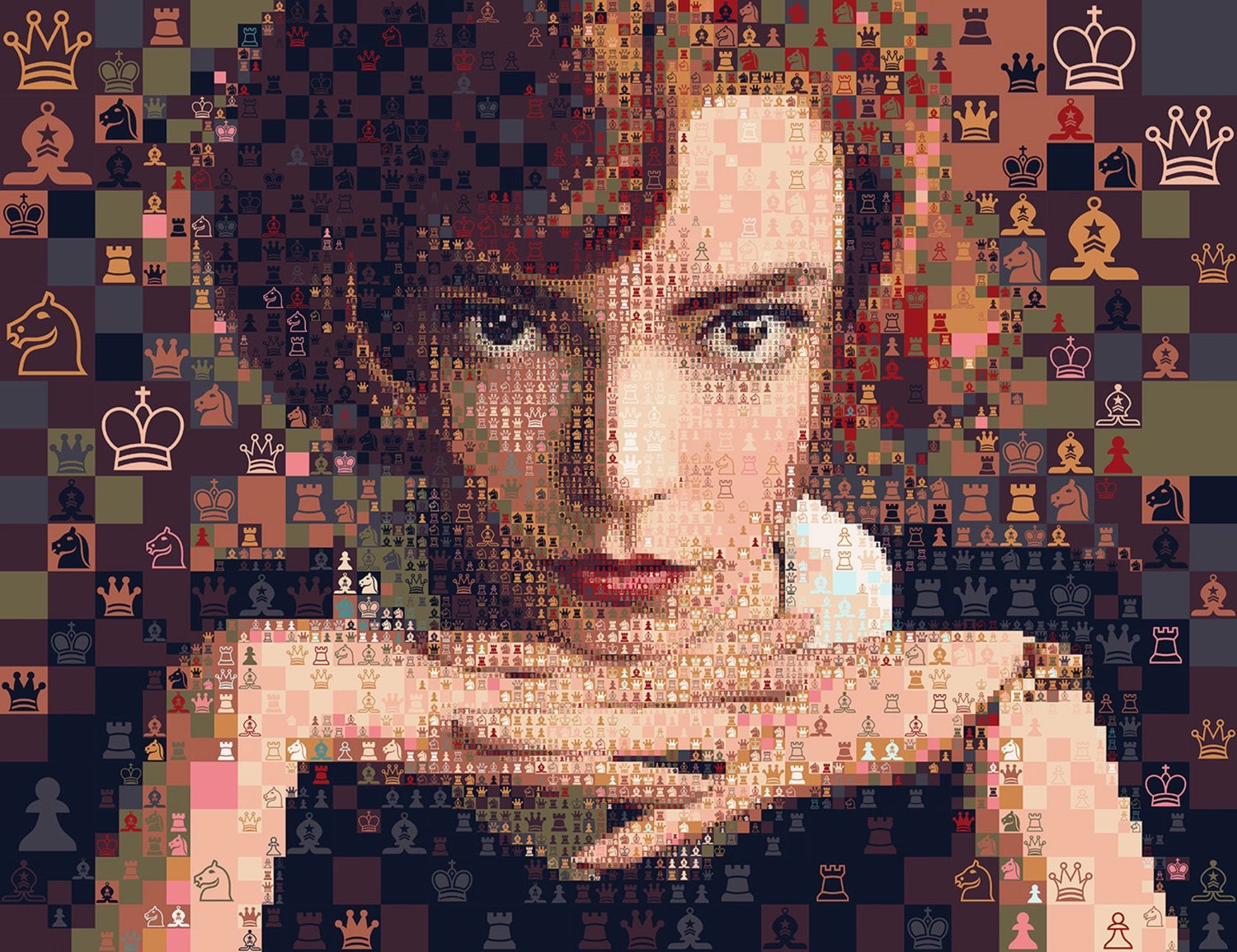
A mosaic plays this game at two scales. Each tile is a figure in its own right: an icon, a letter, a photograph. Together the tiles become the ground from which a larger figure rises, and the viewer moves between the two readings. When the tiles are cut from the same colours as the image, the game goes further: a white wall in one tile is the light on a cheek, and a blue shadow in the next is the line of an eye. The viewer has to rebuild the face from form and absence.
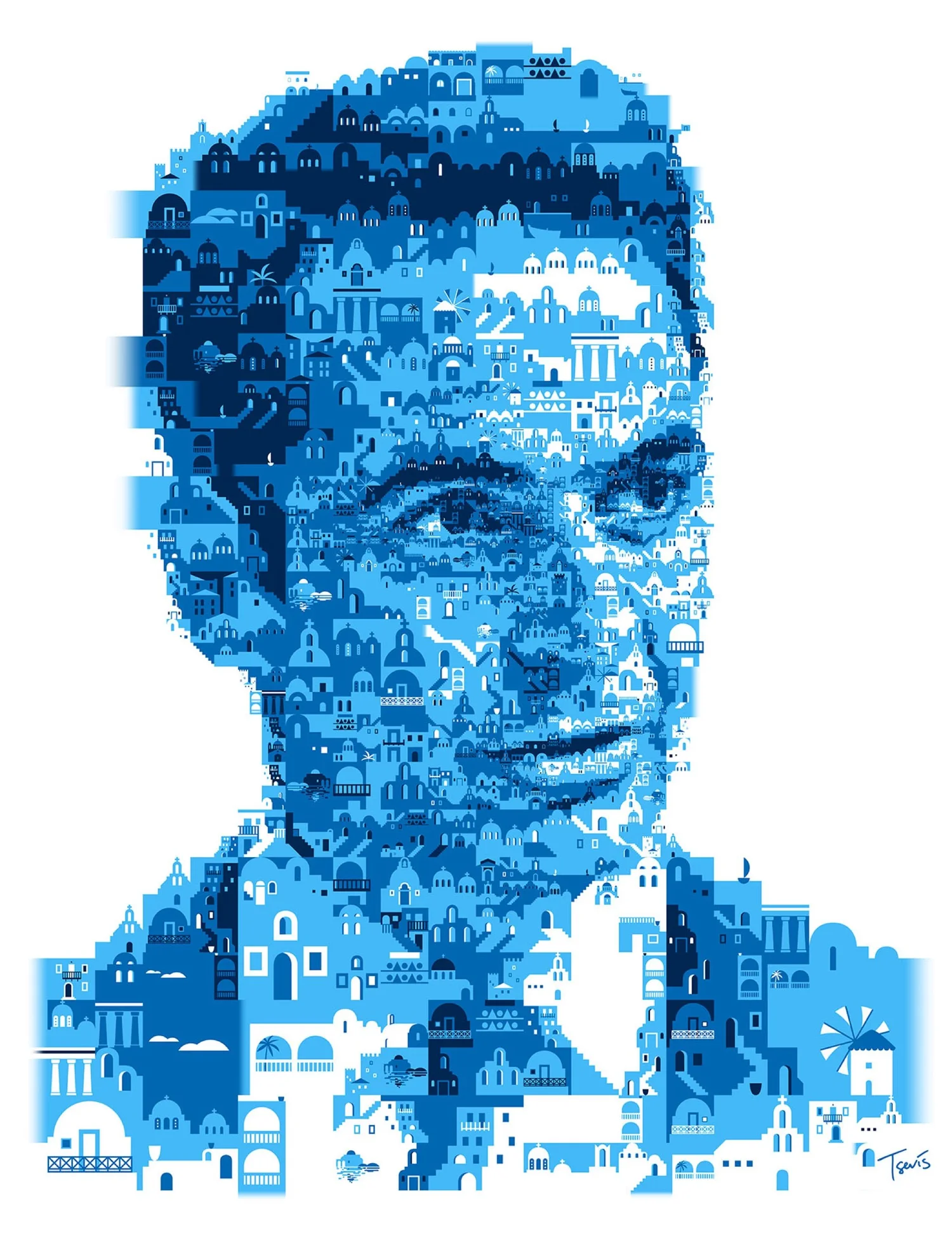

Two portraits that work with figure and ground. Tsevis Studio.
Closure: the eye completes what is missing
Among the laws Wertheimer described is closure: the eye completes forms that are interrupted, and reads an almost closed outline as a closed one.1 In 1955 Gaetano Kanizsa pushed this further with figures in which the eye sees the edges of a triangle where no edge is drawn at all, only three notched discs around an empty space. The contours are made entirely by the viewer.9
A mosaic is full of such gaps. Between every two tesserae there is a joint; at the edge of a figure the pieces stop, scatter or break. The eye bridges all of it and draws the contour the pieces only suggest. The more irregular the pieces, the more of the drawing the viewer supplies, and the more the viewer takes part in the image.
Ernst Gombrich called this contribution the beholder’s share: what the viewer brings to an image from memory and expectation.10 Umberto Eco described works that leave part of their completion to the reader or viewer as open works.11 A mosaic is open in a literal sense. Its contours are finished by the person looking.
Distance is the second material
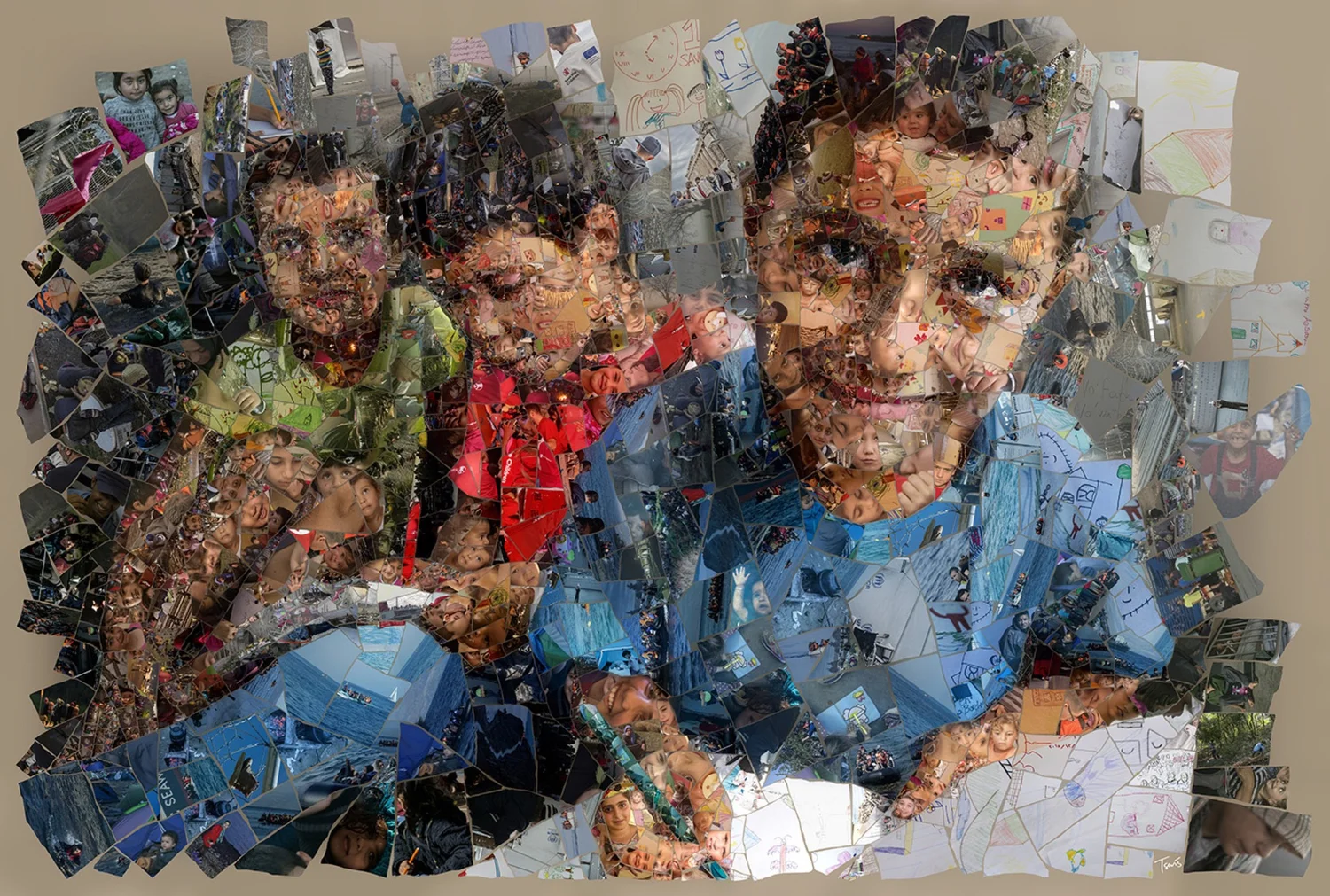
I like to say that distance is the mosaic’s second material. Close to the wall, the eye finds tesserae, joints and the flow of rows. Step back, and the joints close, neighbouring tones merge, and a figure appears that none of the pieces contains. A mosaic asks you to walk. And because it holds two scales at once, several stories can live in one picture: a viewer can take in the whole in a second, or spend an hour among the parts.12

This is why we design every commission for at least two distances. A cover is read at arm’s length and in a thumbnail on a phone; a mural is read from across a hall and from the bench in front of it. The figure has to hold at the far distance and the pieces have to reward the near one.
Tone and colour at a distance
Distance also mixes colour. Seen from far, neighbouring pieces blend into one tone, the way the dots of a printed halftone or the strokes of a pointillist painting do. Seen from close, the same neighbours do the opposite: they push each other apart. Michel-Eugène Chevreul, director of the dye works at the Gobelins tapestry manufactory in Paris, published the law of this effect in 1839: colours placed side by side change each other’s appearance, a lighter one looking lighter next to a dark one, a colour taking on the opposite tint of its neighbour.13
A mosaicist works with both effects at once. The tones of a face have to mix correctly at the far distance, and the pieces have to keep their own colour, and their contrast, at the near one. When the pieces are symbols with little tonal range of their own, such as chess pieces or musical notes, the tone has to be built from their density, their size and their arrangement, which is the problem that halftone and dithering solve. The rules are written down on The Mathematics of the Mosaic.
The Neo-Impressionists made the first of these effects a method. Georges Seurat and Paul Signac painted with small separate touches of colour and left the mixing to the eye at a distance; Signac set out the theory in 1899, with Chevreul as one of its sources.14 Their canvases are mosaics of paint.
The joints: contrast at the edges
In 1870 the physiologist Ludimar Hermann reported that a grid of white lines on a black ground shows grey spots at the crossings, spots that are not there.15 Anyone who has seen dark tiles laid with light grout has seen the same thing. The joints are not neutral. They change the brightness the eye sees in the pieces next to them, and a perfectly regular grid of joints adds a pattern of its own that can compete with the image.
Chuck Close built much of his later work on this ground: portraits painted as grids of small cells, each one a little abstract painting, that become a face only from across the room.
This is one reason the colour and width of the joints are design decisions, in stone as on the screen, and one reason a grid that follows the image, or changes the size of its pieces, often reads more quietly than a rigid one.
A glance and a long look
Vision works at two speeds. In 1996 Simon Thorpe, Denis Fize and Catherine Marlot showed that the brain begins to tell whether a briefly flashed photograph contains an animal about 150 milliseconds after it appears.16 The gist of an image arrives almost at once; its details take as long as the viewer is willing to give them.
A mosaic is made for both speeds. The figure has to land in the first glance: on a magazine cover at a newsstand, in a thumbnail on a phone, on a wall seen while walking past. The pieces are for the long look, the minutes a viewer spends in front of a mural or a print once the glance has caught them. This is the Macro-Micro Narrative in the terms of perception: one message, carried by the glance and by the long look.
Variable size: telling the eye where to look
A grid of equal pieces gives every part of the picture the same weight. The eye still finds the face, because of global precedence, but the surface itself says nothing about what matters. A grid of varying pieces does. Small pieces carry detail and slow the eye down; large pieces are quiet and let it pass.
Research in visual attention describes the same economy from the other side. In 1998 Laurent Itti, Christof Koch and Ernst Niebur published a model that predicts, from colour, intensity and orientation, where in an image attention is likely to go first.17 When the size of the pieces follows a map of that kind, or a map drawn by the artist, the construction of the mosaic and the attention of the viewer work together. The same principle has an older source in design teaching: Nino Di Salvatore’s essay “Teoria dello spazio” treats the space between elements, and their scale, as carriers of meaning.18
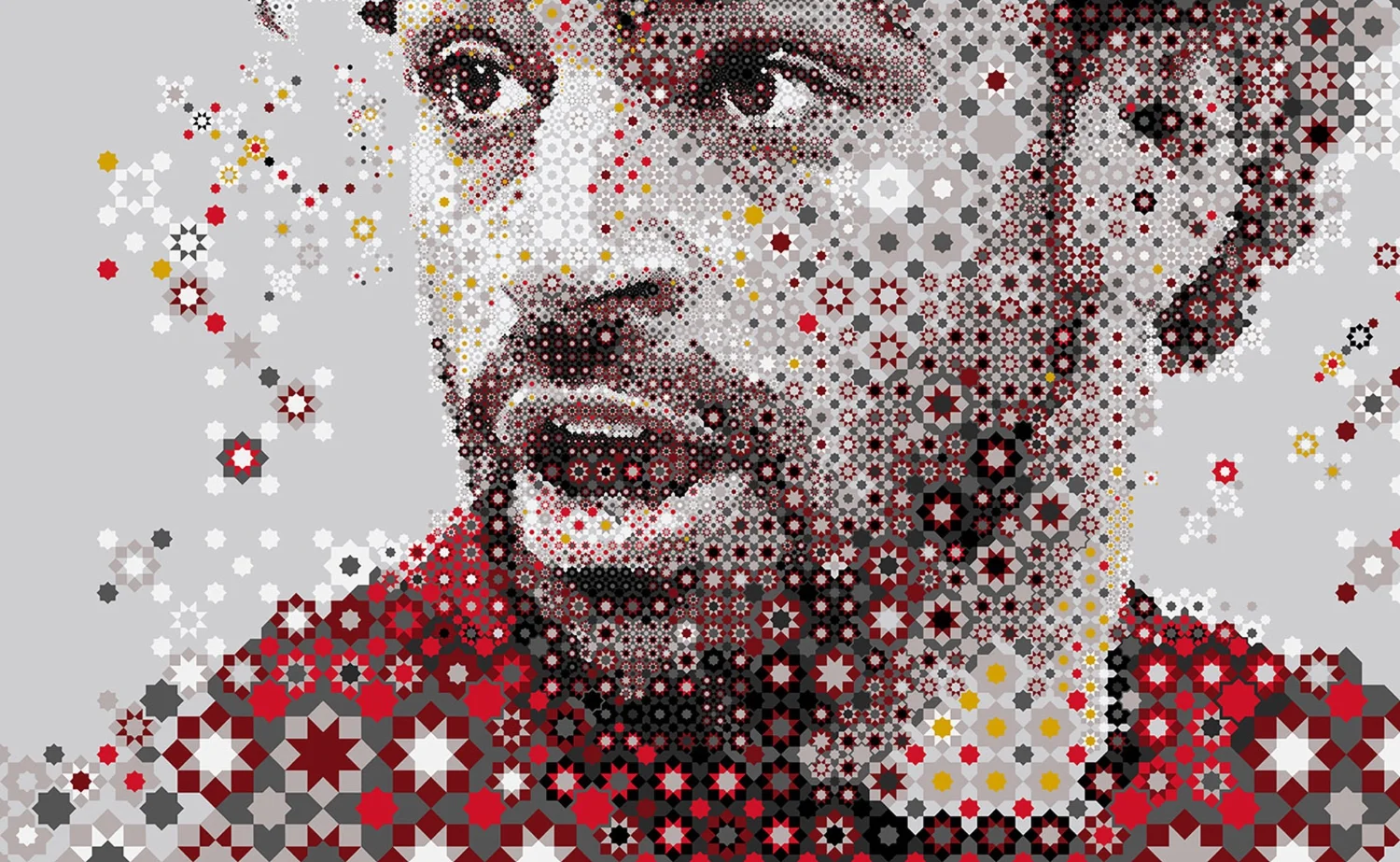
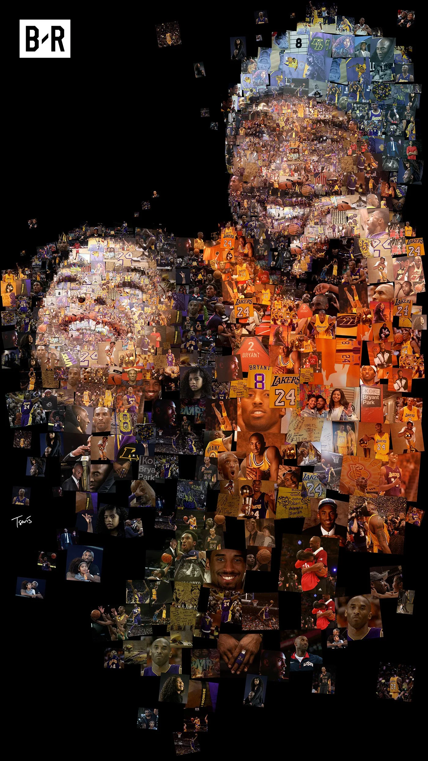
Continuity, the law by which the eye follows a line of pieces as one line, can also be broken on purpose. In some portraits we interrupt the flow of the pieces with what I call staccato algorithms: sudden changes of size, direction and contrast that make the eye pause instead of glide. The interruption gives weight to what comes after it, as a rest does in music.


Staccato: the flow of the pieces broken on purpose. Tsevis Studio.
I wrote at length about this, the pause between looking and seeing, in Psychology of Variable-Size Mosaic Art. How the sizes are computed is on The Mathematics of the Mosaic.
From perception to design
William Blake asked to see a world in a grain of sand.19 Paul Klee wrote that art does not reproduce the visible but makes visible.20 Between them they describe what a mosaic asks of perception: to find the whole in the smallest piece, and to see in the whole what no piece shows on its own.
Two frameworks guide how we design and read a mosaic at Tsevis Studio. Algorithmic Gestalt applies perceptual theory to the computational design of mosaic systems: Gestalt principles of emergence, figure and ground, and proximity become rules that a program can follow and an artist can adjust. The Macro-Micro Narrative is the principle that every scale of a work must carry and amplify its central message: the figure from afar, the pieces from close, and the relationship between them.12, 21
Both stand on a long line of teaching. Rudolf Arnheim’s Art and Visual Perception gave artists a psychology of the eye;22 Gaetano Kanizsa’s Grammatica del vedere gave it a grammar.23 I have taught Gestalt psychology to design students since 1996. In a mosaic I see it at work without disguise, because a mosaic cannot hide the fact that it is made of parts.
Questions
Why does a mosaic look like a picture from far away?
Because human vision perceives the whole before its parts. From a distance, the joints between tesserae close and neighbouring tones merge, so the eye groups the pieces into one figure, as described by Gestalt psychology.
What is Gestalt psychology?
A school of psychology founded in the early twentieth century by Max Wertheimer, Kurt Koffka and Wolfgang Köhler. It studies how the mind organises separate elements into wholes, through laws such as proximity, similarity and continuity.
What is global precedence?
The finding, published by David Navon in 1977, that people perceive the overall form of a figure before its details: a large letter made of small letters is recognised before the small letters are.
Why is a blocky portrait easier to recognise when it is blurred?
Because the sharp edges of the blocks add fine detail that masks the coarse information a face is recognised by. Blurring, distance or narrowing the eyes removes that detail, as Leon Harmon and Bela Julesz showed in 1973.
What is figure and ground in a mosaic?
Figure and ground is the division of a picture into a thing and the space behind it, described by Edgar Rubin in 1915. In a mosaic each tile is a figure of its own, and together the tiles become the ground of a larger figure, so the viewer moves between two readings.
Why do the colours of a mosaic change with distance?
From far, neighbouring pieces blend into one tone, like the dots of a halftone. From close, neighbouring colours push each other apart, the simultaneous contrast that Michel-Eugène Chevreul described in 1839. A mosaic has to work at both distances.
What is closure in Gestalt psychology?
The tendency of the eye to complete forms that are interrupted and to read an almost closed outline as closed. In a mosaic it lets the viewer draw the contours that the separate pieces only suggest.
Why do grey spots appear at the crossings of a tiled grid?
It is the Hermann grid illusion, reported by Ludimar Hermann in 1870: light lines crossing on a dark ground show grey spots at their intersections that are not there. It is one reason the colour and width of a mosaic’s joints are design decisions.
Why do some mosaics use pieces of different sizes?
To direct attention. Small pieces carry detail and hold the eye; large pieces are quiet. When their size follows what matters in the image, the construction of the mosaic and the attention of the viewer work together.
Further reading
- What Is a Mosaic?Meaning, materials, techniques, types and history: the answer, from pebbles to algorithms.
- The Four Layers of a MosaicOne portrait, twenty-seven mosaics: the grid, the tiles and the matching rule, changed one at a time.
- The Mathematics of the MosaicTessellation, Voronoi cells, matching and dithering, written down as equations.
- Mosaic GlossaryThe words of the mosaic, from tessera and andamento to matching rule.
- The Tradition We Work InThe history of the mosaic, from the clay cones of Uruk to Bell Labs.
- Research, Science and TechnologyMatching, importance, Gestalt and geometry: the knowledge behind our instruments.
- Algorithmic MosaicWhat an algorithmic mosaic is, and how we make one.
- ApplicationsWhere mosaics work today: campaigns, editorial, architecture, corporate art and gifts.
- Photographic Mosaics: How the Algorithms DevelopedSixty years of mosaic algorithms, from Bell Labs to diffusion models.
- Mosaic StylesThe styles of our digital work, from classic grids to maps and stained glass.
References
- Max Wertheimer, “Untersuchungen zur Lehre von der Gestalt II,” Psychologische Forschung 4 (1923): 301–350; English translation, “Laws of Organization in Perceptual Forms.” psychclassics.yorku.ca
- David Navon, “Forest before trees: The precedence of global features in visual perception,” Cognitive Psychology 9, no. 3 (1977): 353–383. doi:10.1016/0010-0285(77)90012-3
- Leon D. Harmon, “The Recognition of Faces,” Scientific American 229, no. 5 (November 1973): 70–82. doi:10.1038/scientificamerican1173-70
- Leon D. Harmon and Bela Julesz, “Masking in Visual Recognition: Effects of Two-Dimensional Filtered Noise,” Science 180, no. 4091 (1973): 1194–1197. doi:10.1126/science.180.4091.1194
- Victoria and Albert Museum, Kenneth C. Knowlton and Leon D. Harmon, Studies in Perception I, 1967, collection record. collections.vam.ac.uk
- Nancy Kanwisher, Josh McDermott and Marvin M. Chun, “The Fusiform Face Area: A Module in Human Extrastriate Cortex Specialized for Face Perception,” Journal of Neuroscience 17, no. 11 (1997): 4302–4311. doi:10.1523/JNEUROSCI.17-11-04302.1997
- Giuseppe Arcimboldo, Vertumnus, c. 1590–1591, oil on panel, Skokloster Castle, Sweden.
- Edgar Rubin, Synsoplevede Figurer, doctoral dissertation (Copenhagen, 1915).
- Gaetano Kanizsa, “Margini quasi-percettivi in campi con stimolazione omogenea,” Rivista di Psicologia 49 (1955): 7–30.
- Ernst H. Gombrich, Art and Illusion: A Study in the Psychology of Pictorial Representation (London: Phaidon, 1960), part three, “The Beholder’s Share”.
- Umberto Eco, Opera aperta (Milan: Bompiani, 1962).
- Tsevis Studio, The Tradition We Work In, sections I, III, IV, X and XIII. tsevis.com
- Michel-Eugène Chevreul, De la loi du contraste simultané des couleurs (Paris: Pitois-Levrault, 1839).
- Paul Signac, D’Eugène Delacroix au néo-impressionnisme (Paris: Éditions de la Revue blanche, 1899).
- Ludimar Hermann, “Eine Erscheinung simultanen Contrastes,” Pflügers Archiv für die gesammte Physiologie 3 (1870): 13–15.
- Simon Thorpe, Denis Fize and Catherine Marlot, “Speed of processing in the human visual system,” Nature 381 (1996): 520–522. doi:10.1038/381520a0
- Laurent Itti, Christof Koch and Ernst Niebur, “A model of saliency-based visual attention for rapid scene analysis,” IEEE Transactions on Pattern Analysis and Machine Intelligence 20, no. 11 (1998): 1254–1259. doi:10.1109/34.730558
- Nino Di Salvatore, “Teoria dello spazio,” in the catalogue of the Scuola Politecnica di Design, Milan, 1992.
- William Blake, “Auguries of Innocence”, written c. 1803.
- Paul Klee, “Schöpferische Konfession”, in Tribüne der Kunst und Zeit 13 (Berlin: Erich Reiss, 1920).
- Tsevis Studio, Algorithmic Mosaic: What It Is and How We Make It. tsevis.com
- Rudolf Arnheim, Art and Visual Perception: A Psychology of the Creative Eye (Berkeley: University of California Press, 1954).
- Gaetano Kanizsa, Grammatica del vedere (Bologna: Il Mulino, 1980).
About the author
Charis Tsevis is a Greek visual designer and computational artist educated in Athens and Milan. A designer since the late 1980s, he has worked with mosaics for more than three decades and builds his own tools for them. He has taught design thinking, colour theory and Gestalt psychology at art colleges since 1996. With Vira Konstanta he runs Tsevis Studio. About the studio.
Version and how to cite
Version 1.0, 2026-10-20. Corrections are listed here with their dates.
Tsevis, Charis. “Why a Mosaic Works: Perception, Gestalt and Distance.” Tsevis Studio, 2026-10-20. https://www.tsevis.com/mosaic-and-perception