Visual Theory, part 2
Augusto Garau, my teacher in Milan, did not stop at pairs of colors. He arranged them into a chromatic continuum: passages from one pure color to another in which every neighbor shares a primary with the next, so the whole surface holds together. This article explains what the continuum is, how it grows out of the circle of twelve hues, and how it organizes a composition.
Key points
- The continuum is the circle of twelve hues read as three overlapping families. Each family is one primary with the six mixtures that contain it.
- Neighbors in the continuum always share a primary, so they bind.
- A pure color can crown its family as its apex, but only where it is brighter than its mixtures.
- Arnheim’s four pairings become roles in a composition: binding a figure, completing it, holding a ground, or marking a border.
- It is a painter’s rule, shown on painted plates. As far as I can find, nobody has tested it since.
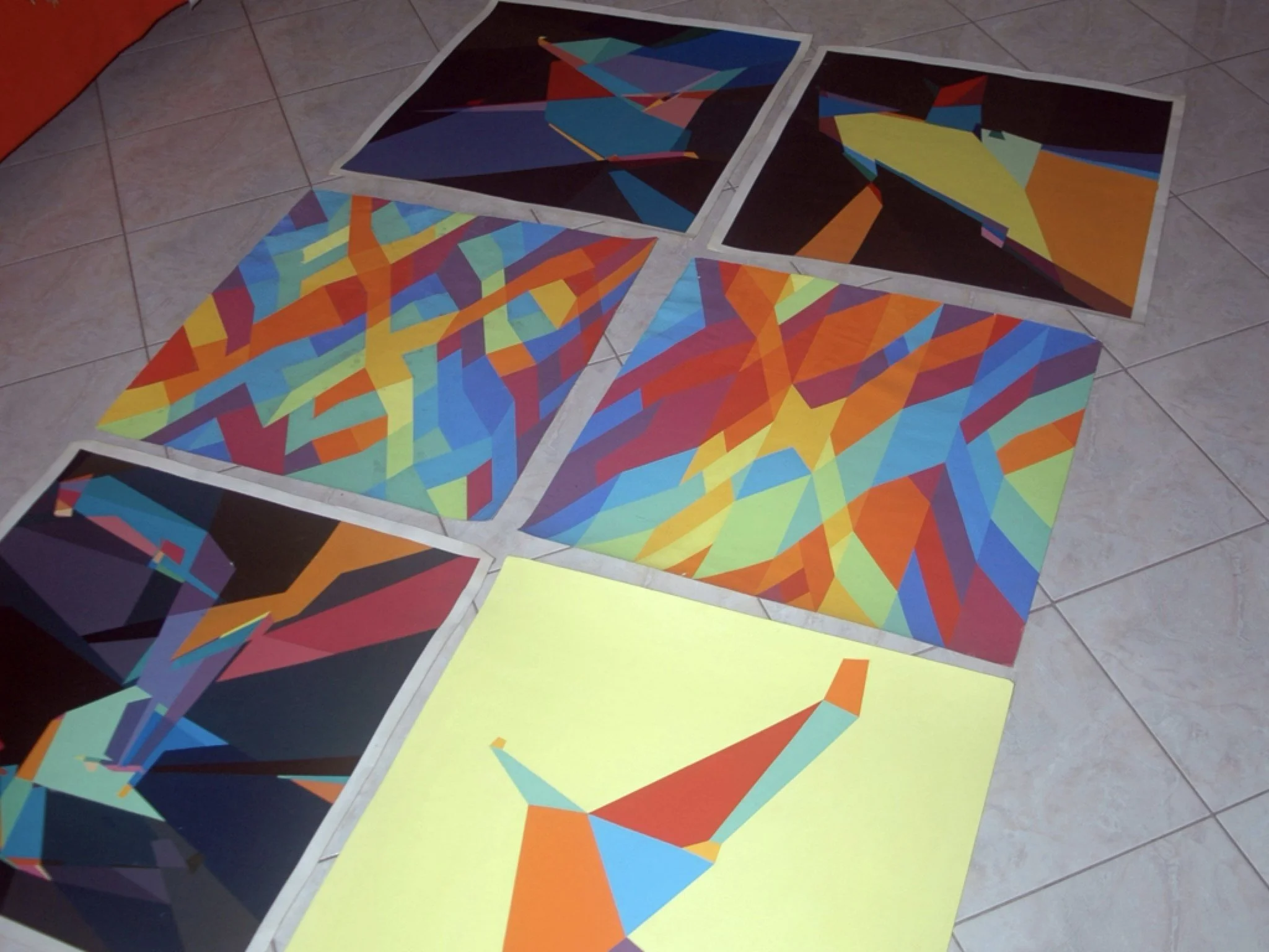
Garau taught the chromatic continuum in his color course at the Scuola Politecnica di Design in Milan, where I was his student from 1990 to 1992. In class he called it the continuum cromaticum, and one of our exercises was to build compositions with it.
From pairs to passages
Part 1 of this series was about pairs: two tertiary colors side by side, and what the primary they share does to them. Garau’s first chapter goes the other way. It starts from a single pure color and asks what happens when it meets a mixture that contains it (Color Harmonies, pp. 7–9). There are three cases:
- The pure color is dominant in the mixture (yellow beside
rY). The mixture reads as yellow drifting away toward red, and at the same time it is pulled back toward yellow. Two tensions run against each other. - The pure color is subordinate in the mixture (yellow beside
yR). Now two different colors meet, and the yellow in the second acts as a bridge between them. - The mixture is a balanced secondary (yellow beside orange). The pair looks unfinished, as if one color were missing. It settles only when the secondary stands between its two primaries: yellow, orange, red (plate 2).
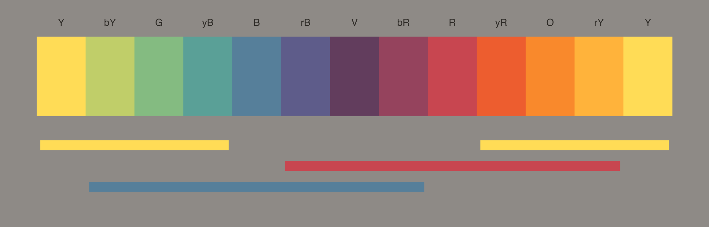
From there Garau stops thinking in pairs. A pair is a building block, and blocks laid end to end make a passage from one pure color to another. Every intermediate mixture shares a primary with its neighbor, so nothing in the passage breaks. This is what he calls the chromatic continuum (p. 9), the continuum cromaticum of his classes.
Three families of six
Each primary is contained in six mixtures: its two tertiaries where it dominates, its two secondaries, and its two tertiaries where it is subordinate. Garau places each primary at the center of its six. The dominant tertiaries sit next to it, then the secondaries, then, farthest away, the tertiaries where it is the minor color (p. 7, fig. 3).

The three families overlap. The three mixtures to the right of yellow
(yR, O, rY) are the same three as those to the left of red, and red’s
right side is blue’s left side. So the families join into a single closed
sequence (p. 10, plates 3 and 4):
Y · bY · G · yB · B · rB · V · bR · R · yR · O · rY · Y
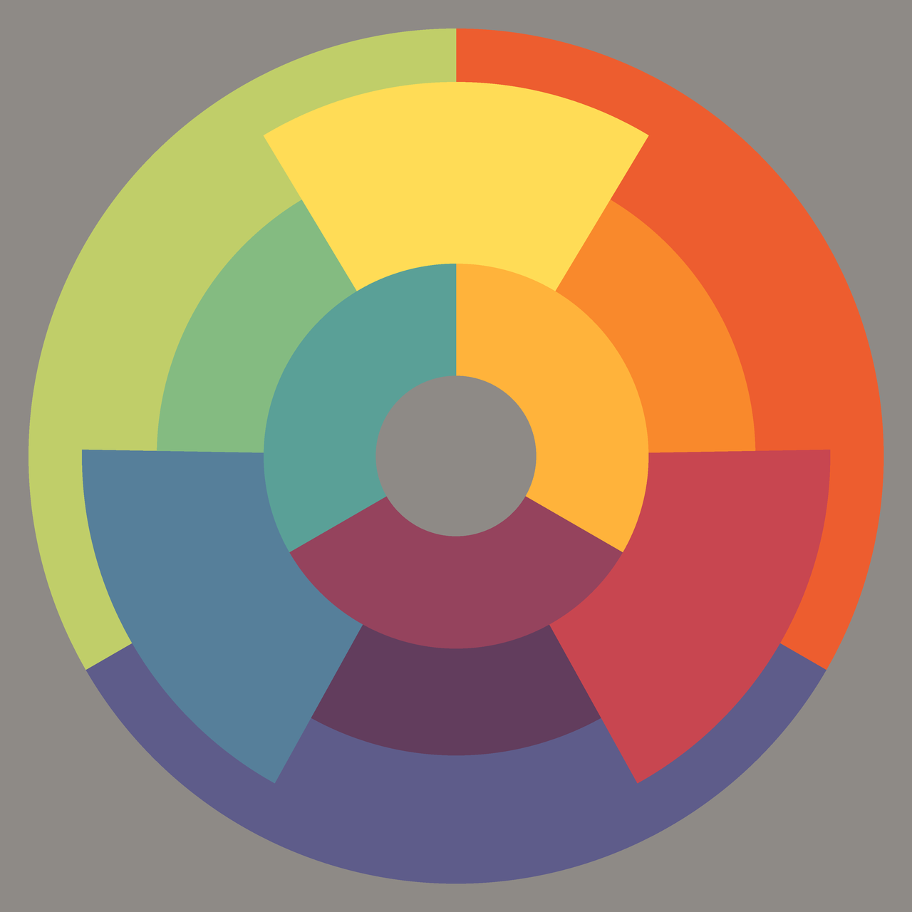
A sequence that ends where it began belongs on a cylinder. Garau flattens it into the section of a cone, so that the whole continuum fits on one disk (plate 5).
The disk on the cover
The disk of plate 5, which Garau titled the chromatic continuum disk, is
the image on the cover of Le armonie del colore. I do not remember him
discussing it in class, so what follows is my own reading. Each primary is
a wedge, and
each wedge touches exactly the six mixtures that contain its color: the
yellow wedge touches bY, yR, G, O, yB and rY, and nothing else. The
outer ring (bY, yR, rB) and the inner ring (yB, rY, bR) are the
two triangles of partial inversion from part 1. The disk is not a
decoration of the circle. It is a map of which colors can touch.
The pure color at the top of the stair
A pure color can become the apex of its continuum, the point toward which the passage climbs. Garau gives two conditions: it must look pure, and it must be brighter than the mixtures around it (pp. 10–11). He describes such a pure color as “the last step of a staircase that has the pure color at its top” (p. 11).
Brightness decides which primary can crown which family:
- Yellow, the brightest primary, is the apex of all six of its mixtures (plate 6).
- Red is the apex only on its blue side:
bR, violet,rB(plate 7). - Blue is the apex only over
rBand violet (plate 8).
For his brightness ratios Garau leans on Schopenhauer: orange is about twice as bright as blue, yellow three times as bright as violet. Two of his students at the Scuola Politecnica di Design, Elena Fraternali and Silvia Iazzarelli, painted compositions around a red apex and a yellow apex (plates 9 and 10).
This is the staircase from part 1, the strict circle in which every step down from yellow is the same. In the book it is more than a discipline for mixing. It tells you where the light of a composition can sit.
Garau adds a remark from Arnheim: painters put pure colors at the extremes of a form, its points of greatest convexity or concavity. In Cézanne the farthest point between two objects is often a pure blue, and the nearest part of an apple is left white in watercolor or painted in a pure color (p. 9).
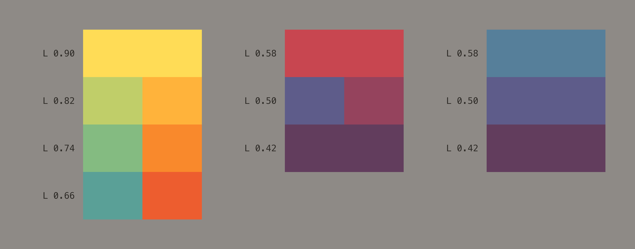
bR, violet and rB, blue above rB and violet. The numbers are the lightness of each step (OKLCH L). After Color Harmonies, plates 6–8.How the continuum organizes a composition
The continuum is not a palette. It is a set of rules for placing colors so that the parts of a picture bind or separate where the painter wants. Garau scatters these rules through his chapters on the four pairings:
- Context first (pp. 9–10). On gray, a pair shows its own tension. On a color, it should be surrounded by the complementary of the pair as a whole. Among other hues, a pair can split and its members can join their neighbors, even on different depth planes. Or it can hold together and stand as a figure on a colored ground. Between contrasting hues it always reads as one area within the continuum.
- Complete inversion binds a figure (pp. 13–14).
yRwithrY, orbYwithyB, makes the tightest bond there is. Garau recommends it for many-colored objects that must hold together. But the pair uses only two primaries, so it is incomplete. Put the missing primary in the ground (plate 16), or better, the complementary of each member (plate 17). - Shared subordinate completes (p. 14). Those complementaries form a shared-subordinate pair, whose common minor color binds the two mixtures along the continuum. It already holds all three primaries and needs nothing more.
- Shared dominant makes a ground (p. 14). The common major color gives the pair an almost uniform base, so as a ground it reads as one color. Under a complete inversion, it brings the figure out most clearly.
- Partial inversion marks a border (pp. 18–19). It is the most divided pair. In a continuum it can do one of two jobs. On a uniform ground, best the complementary of the pair’s sum, it shows its own tension. On a varied ground its members split and join neighboring hues, and the pair becomes a dividing line between areas or between depth planes.
Read together, these rules describe a surface in which every border is a decision. Neighbors that share a primary flow into each other. A partial inversion cuts. The pure color sits at the summit. Garau states the stake in his introduction: the same laws that build the unity of a figure also produce its separation (p. 5). In his later chapters, when color and form disagree, the figure falls apart (plates 25–29).
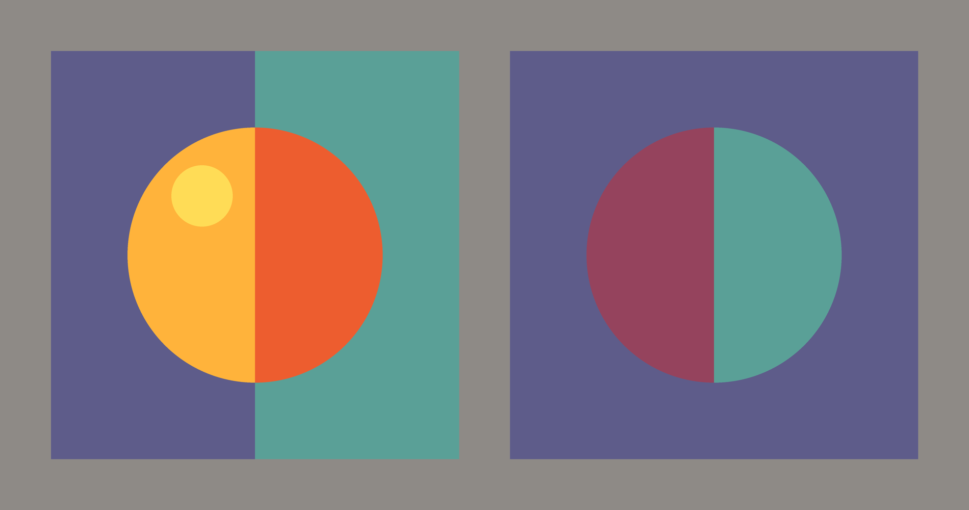
rY and yR, each half on its complementary (rB, yB), with a pure yellow at its apex; the disc holds as one figure. After Color Harmonies, p. 14. Right: a partial inversion, bR and yB, on a ground of rB: bR binds with the ground and the disc splits. After pp. 18–19.What the book does not settle
The continuum is shown, not measured. Garau demonstrates it on painted plates and reports no observers and no data, as with the rest of the book. In his 1987 review in Leonardo, Arnheim discusses the four pairings, figure and ground, and transparency, but not the continuum. I have found no later study that tests it. It stands as a painter’s rule, and a useful one.
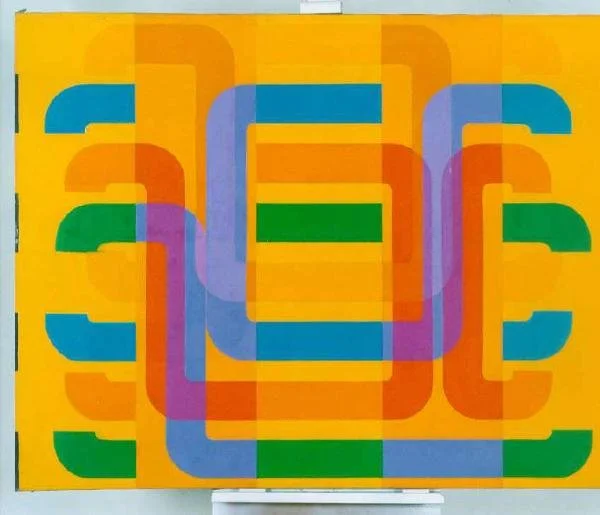
Garau kept the word for his own painting too: Continuum is the name of one of the cycles that followed his “C” series of the mid-1970s. In the MA*GA museum in Gallarate there is a canvas of 1985, Labirinto, with Continuum in giallo written in pencil on its stretcher. Its U-shaped bands, in three vertical strips over a yellow ground, overlap into chromatic transparencies.
The continuum in my own work
Almost all of my neofuturistic work rests on the continuum: continuity and contrast. Neighbors that share a primary carry the eye across the surface, and a contrast placed on purpose stops it where the form needs an edge.
My colors, though, go beyond the strict twelve. On the last day of the course Garau told us to tear up our circles and make our own colors. What stayed is the structure: which colors may touch, which one sits at the top, and where a passage should break.
The three families in one campaign
For the Estrella Damm World Padel Tour (2014) I made a series of close-ups of the game. Seen together, four of them read almost as a lesson in Garau’s families.
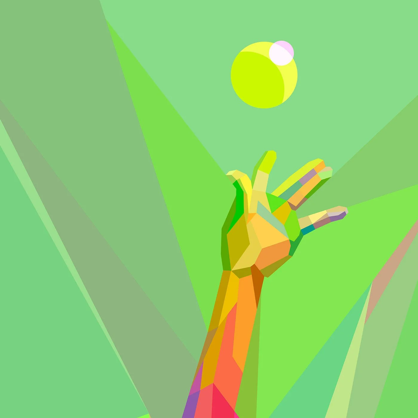
A hand and a ball. The yellow-green ball is the lightest point in the picture. Below it the field runs through yellow-greens and greens, and the hand is in yellows and ochres. Everything here contains yellow, so the whole picture is one passage of yellow’s family, with the purest yellow at the top of the stair.
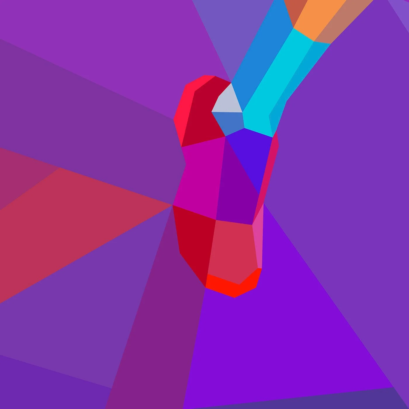
The grip. The red family. A red hand and grip sit on violets and purples, the mixtures red can crown (bR, V, rB). A single blue sleeve enters from above, the one voice from outside the family.
The paddle arm. The blue family. Cyans, blues and blue-greens fill the ground, and the arm, in oranges and yellow-reds, crosses it. The family binds the ground into one surface; the warm arm stands out against it.

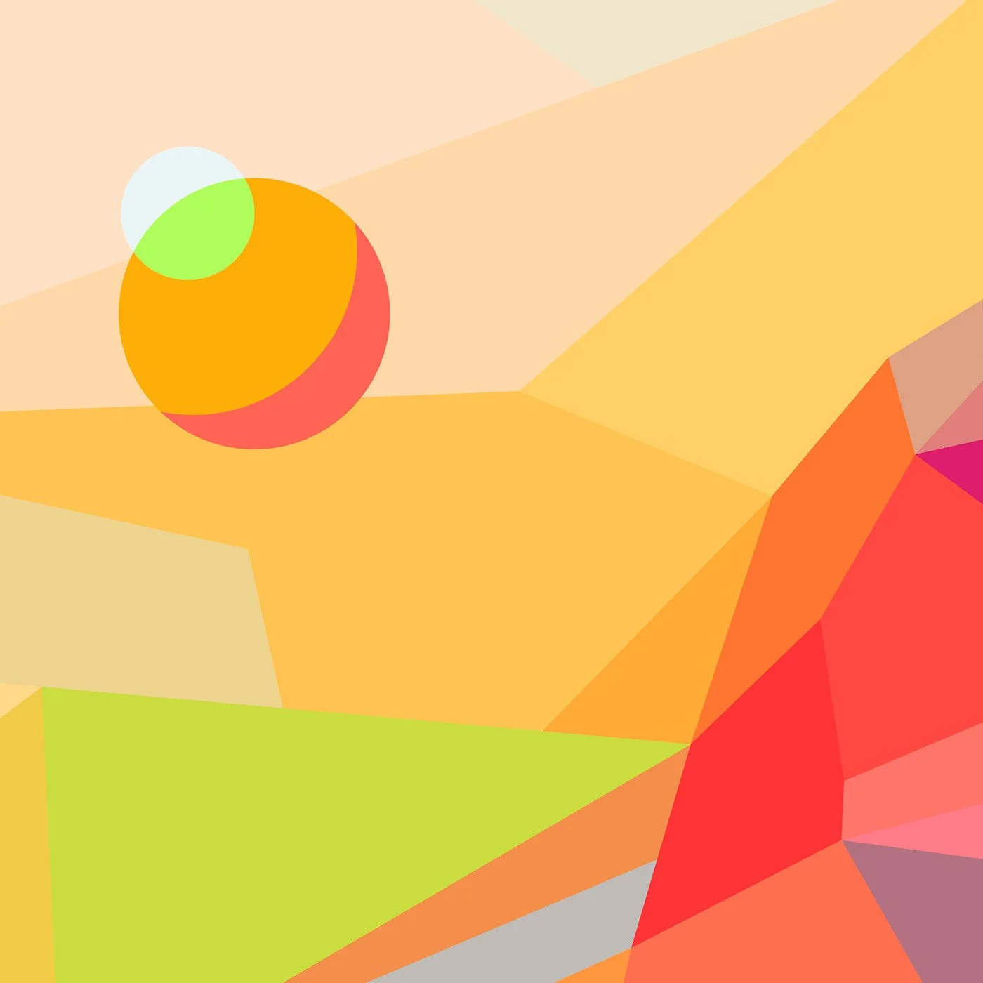
The ball on a warm field. A passage from pale yellow through yellows and oranges to red, with the orange ball in the middle of it and a light yellow-green highlight at its top.
More passages
Yahoo! Sports, London 2012. The gold medal is the brightest thing in the picture, a yellow at the top of a passage of greens and teals, all mixtures that bind yellow to blue. It is Garau’s apex as plainly as I have drawn it. The magenta ribbon is the one cut.

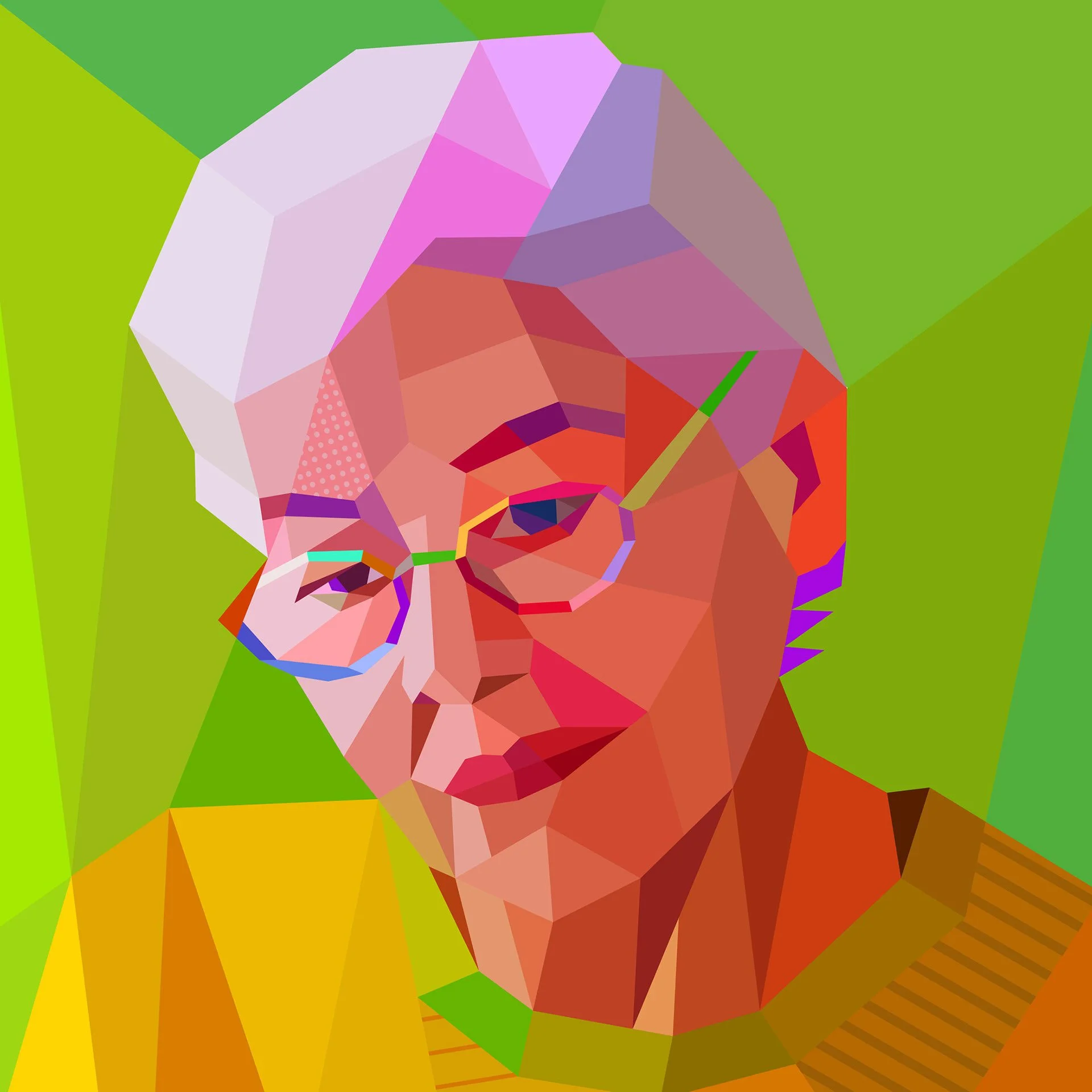
Nordic Global. A face in reds and corals on a field of yellowish greens. The yellow-orange collar sits between them and shares yellow with both, so the head joins the ground there instead of being cut out of it.
ACC.19, American College of Cardiology. The doctor’s coat climbs through pale yellow-greens toward a near-pure yellow; behind her the ground passes from blue through violet to magenta. Two passages meet at her shoulder, warm against cold.

Legendary Area, Moscow. The player’s face is built from oranges, reds and yellows, and the ball is the lightest of them. The water around her stays in blues and violets, a contrast held at the edge of the figure.
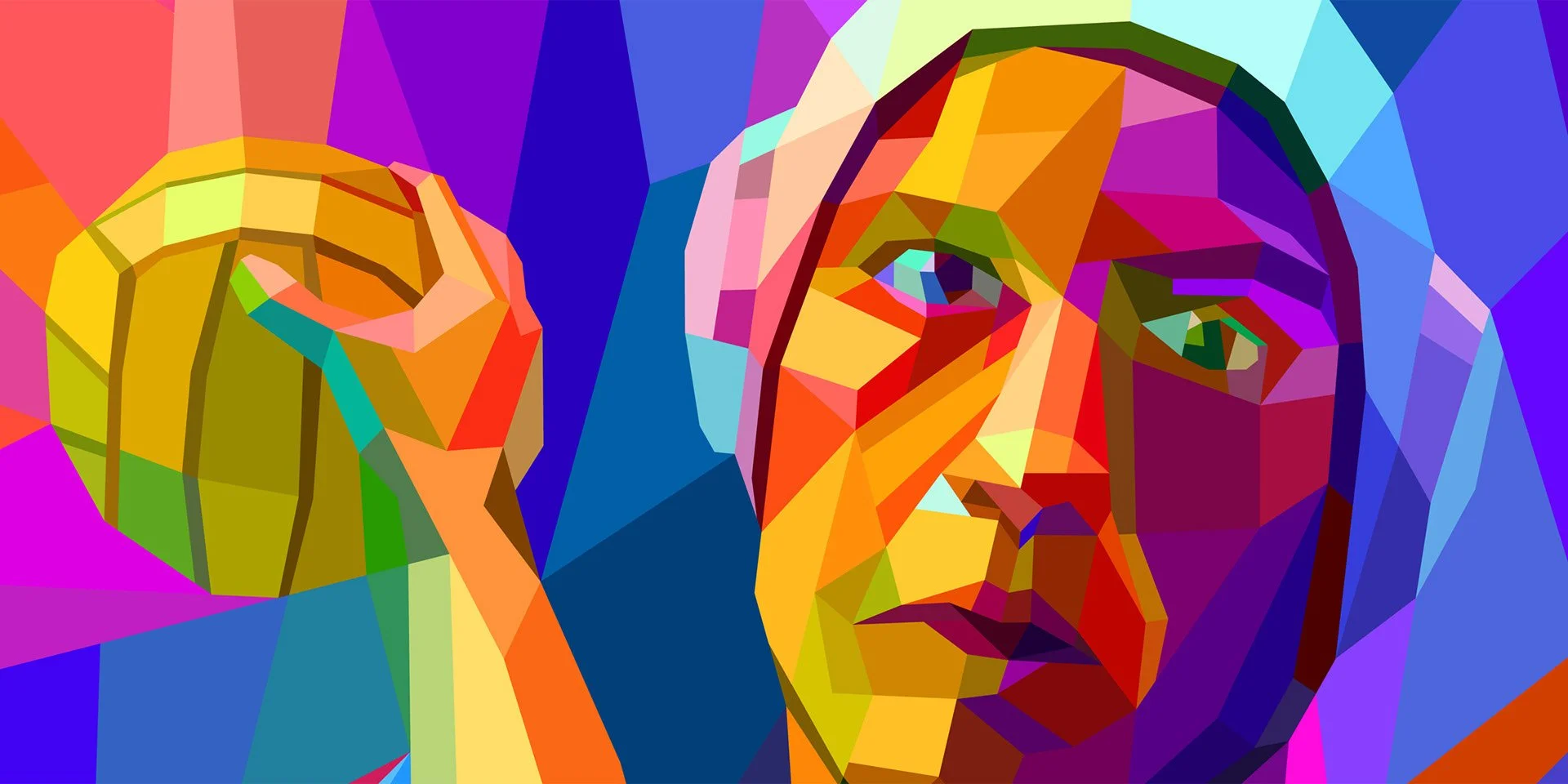
Digilant: Above and Beyond the Data (2013). The megaphone is the continuum itself, wrapped around an object. Its bands step through red, orange, yellow, green and violet, each beside a neighbor it shares a primary with, on a cyan ground.

Questions
What is Garau’s chromatic continuum? The circle of twelve hues read as passages from one pure color to another, in which every neighboring color shares a primary with the next, so the colors bind into one surface.
How is it different from a color wheel? A wheel lists hues. The continuum says which hues may touch, which one crowns a passage, and where a passage should break.
What is the apex of a chromatic continuum? A pure primary placed at the top of its passage, where it is purer and brighter than the mixtures around it. Yellow can crown all of its mixtures; red and blue only some.
Where does Garau describe it? In chapter 1 of Le armonie del colore (Feltrinelli, 1984), in English Color Harmonies (University of Chicago Press, 1993), pp. 7–12, with plates 1–10.
References
- Arnheim, R. (1954). Art and Visual Perception. University of California Press.
- Arnheim, R. (1987). Progress in color composition. Leonardo 20(2), 165–168. doi:10.2307/1578333
- Artribune (n.d.). Augusto Garau: dal MAC alla Gestalt. https://www.artribune.com/?p=367528
- Garau, A. (1984). Le armonie del colore, preface by R. Arnheim. Feltrinelli. English: Color Harmonies, trans. N. Bruno, foreword R. Arnheim, University of Chicago Press, 1993.
- Lombardia Beni Culturali, SIRBeC record A0020-00691: Augusto Garau, Labirinto, 1985. https://www.lombardiabeniculturali.it/opere-arte/schede-complete/A0020-00691/