Visual Theory, part 1
How can flat, opaque color look transparent? Augusto Garau, painter and my teacher in Milan, answered with a theory of perceptual transparency built on how colors look, not on how light behaves. This article explains his theory, Rudolf Arnheim’s color grammar behind it, what vision science found afterwards, and how I use it in my neofuturistic work.
Key points
- Perceptual transparency is a veil the eye sees in opaque color: it depends on visual mixtures, not on physics.
- Garau’s rule: the color the two overlaps share becomes the veil’s color; its role, minor or major, sets how transparent the veil looks.
- His four kinds of veil follow Arnheim’s four pairings of tertiary colors.
- Vision science has confirmed parts of the idea and never tested the rest.
- Garau Armonie, a free web app, runs his rules as code.
A veil made of nothing
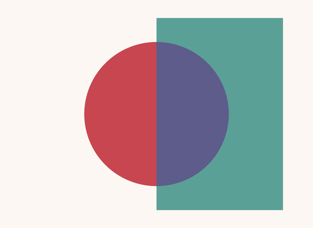
Paint two rectangles that overlap. Fill each of the four resulting regions with a flat, opaque color. Nothing on the canvas is transparent: every square centimeter is covered by pigment that blocks the one beneath it. Yet, with the right four colors, you see one rectangle through the other, a colored veil lying over a ground.
Psychologists call this perceptual transparency. It is one of the clearest proofs that seeing is not recording: the eye takes a single color in the overlap and splits it in two, one part for the veil and one for what lies behind it. Physics has no part in it. A real filter can look opaque, and opaque paper can look like glass.
I learned this in Milan, at the Scuola Politecnica di Design, from Augusto Garau, painter and professor of color theory and the psychology of form. I was there from 1990 to 1992, first in the Visual Design course and then in the Master in Visual Design, and Garau taught me two subjects: Teoria del colore and Psicologia della forma.
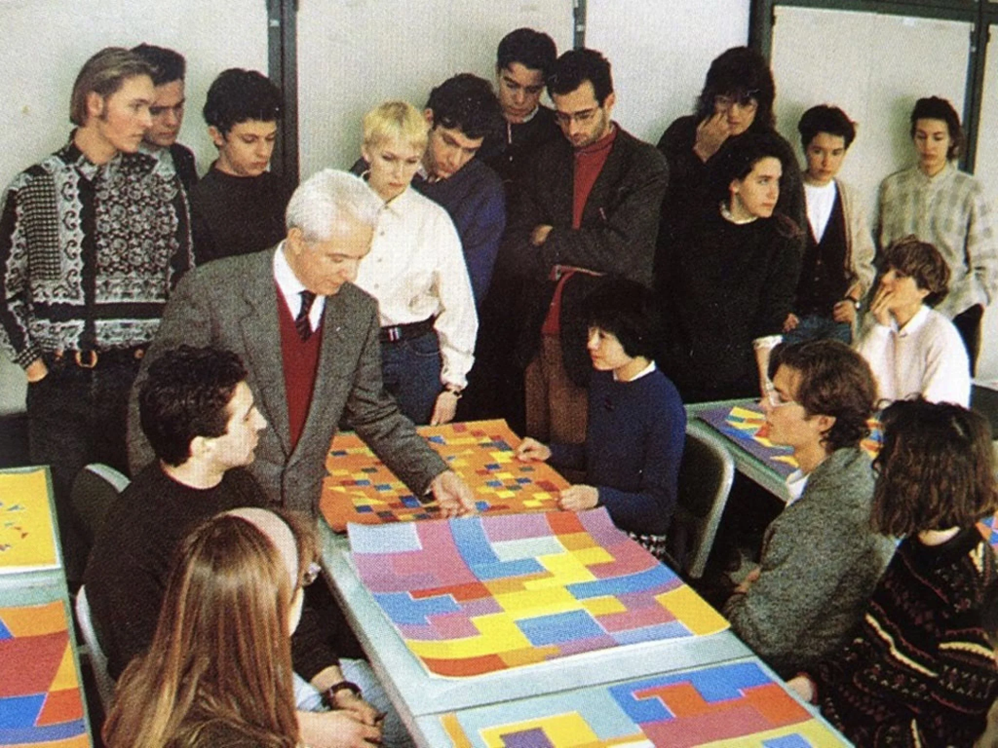
He made us study color the hard way. We mixed it ourselves, from the best pigments we could find, compared every mixture against the others, and did it at noon on an ordinarily bright day, so that the light would not lie to us. The lesson under the exercise was that color is never one thing: it shifts with light, with its neighbors, with the mind looking at it, and it belongs as much to nature as to us.
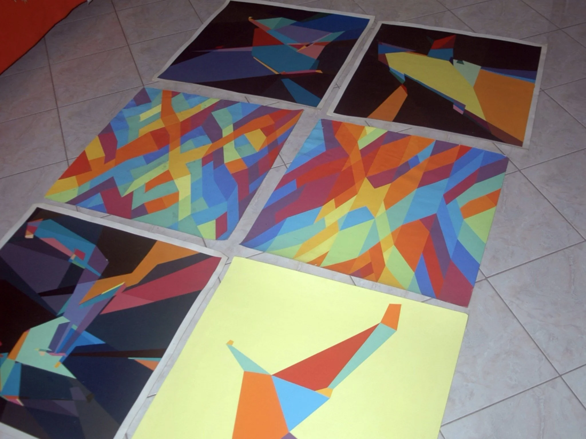
He told me I was his favorite student that year, because I gave the theory and the practice more hours than anyone else in the class. Then he gave me 29 out of 30. When I asked why, he said he graded every student with a message, and mine was: you are not perfect; ask again and I will lower it, so that you see the distance you still have to cover. When I asked why weaker students had higher marks, he told me never to care what others do: the only competition is with yourself. It is the only grade I remember from the whole program. Excellent, but not perfect. Years later, when I taught, I graded the same way: a message to each student, encouragement for the weak who were improving, a glimpse of the road ahead for the strong. We did not stay in touch after Milan, but I followed his work until his death.
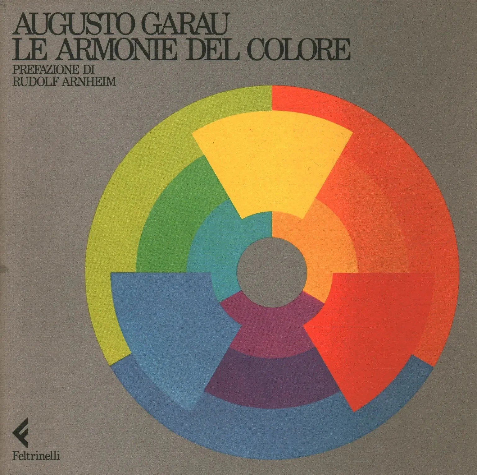
Garau (Bolzano, 1923 – Milan, 2010) was the youngest signatory of the founding manifesto of the Movimento Arte Concreta in 1948, and from 1973 taught the theory of form and color at the Scuola Politecnica di Design. In the 1970s his regular contact with the Trieste psychologist Gaetano Kanizsa turned his painting toward the study of perception: anomalous surfaces, chromatic continua, and, for decades, transparencies. He spent much of his life on one question: when the veil is colored, which colors make it appear? His answer is in Le armonie del colore (Feltrinelli, 1984), with a preface by Rudolf Arnheim, translated as Color Harmonies (University of Chicago Press, 1993). The Italian edition is the one I studied. It is, as far as I can find, the only theory of chromatic transparency written by a painter, for painters and designers.
This first article in the series explains the theory, sets it against what vision science found afterwards, and shows how I use it.
What the eye needs to see a veil: Metelli’s conditions
The study of transparency began with form. Gestalt psychologists showed that the shared region must be split between two figures that each stay whole, and Gaetano Kanizsa showed in 1955 that it takes four regions, not three: two of the ground, and the two parts of the veil that lie over them.
Fabio Metelli, at Padua, turned this into algebra in the 1970s. He modeled the veil as a spinning disk with an open sector, an episcotister, which lets through a fraction α of the ground and adds the rest from its own color t:
p = α·a + (1 − α)·t q = α·b + (1 − α)·t
Here a and b are the two grounds and p and q the two overlaps. Solve the pair and you get the veil back from what you see:
α = (p − q) / (a − b) t = (a·q − b·p) / ((a + q) − (b + p))
The equations give the conditions. The veil must reduce contrast (the two overlaps differ less than the two grounds) and must keep the order (the lighter overlap lies over the lighter ground). Break either and the veil disappears into four flat patches.
Metelli worked in grays. With color, three numbers replace one, and the conditions remain necessary but stop being enough: displays that satisfy them still fail to look transparent. Osvaldo Da Pos showed this experimentally in the late 1970s. Garau starts from that gap.
The grammar: Arnheim’s tertiary colors and color harmony
Garau’s tools come from Rudolf Arnheim’s Art and Visual Perception (1954). Traditional harmony, Arnheim argued, only teaches how colors connect. A composition also needs separations, the way Schönberg’s scale gives the composer discords as well as concords.
Take the painter’s three primaries, yellow, red and blue, as they look,
not as light or ink produce them. Mix two in equal parts and you get a
balanced secondary: orange, green, violet. Mix them two to one and you get a
tertiary, an unbalanced color that leans toward its stronger component.
Garau writes the stronger primary in capitals: yR is a yellowish red, bY
a bluish yellow. Tertiaries are restless, like leading tones in music, and
Arnheim placed the active tensions of color in them.
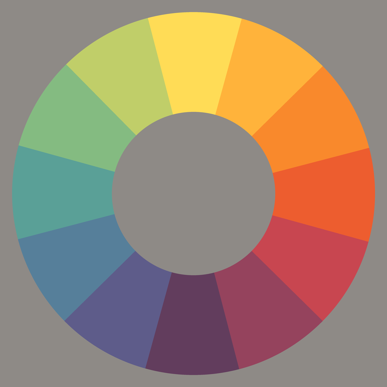
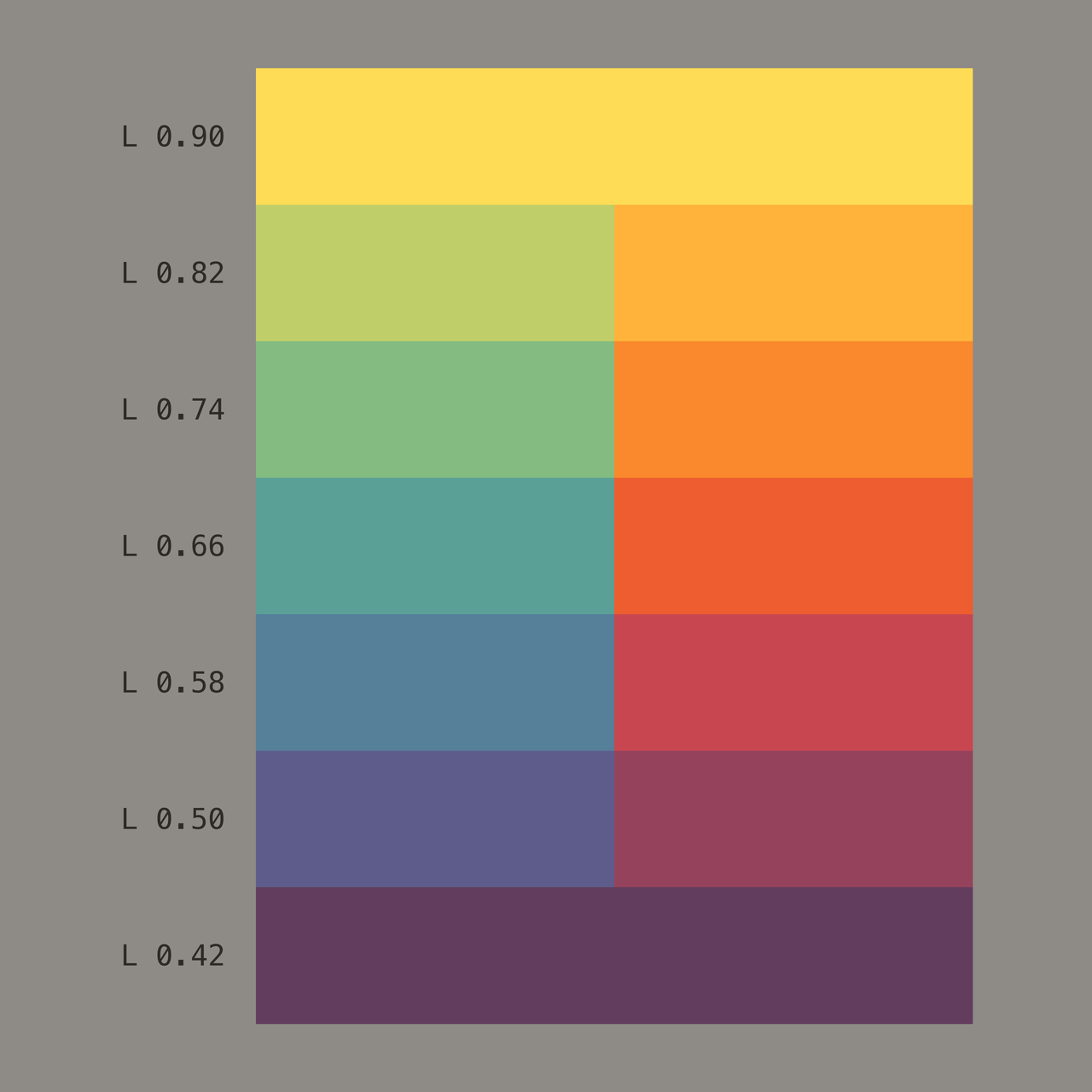
For Garau the circle was a staircase. Every step down, from yellow to violet on either side, had to be the same step in hue and in lightness, like the treads of a stair: no sudden change anywhere, because an uneven step is where you trip. He was absolute about it, and so strict that we would mix the colors exactly as he held them to be. Among ourselves we thought him rather authoritarian. He only wanted to give us a very solid, logical ground for color. On the last day he told us to tear up our circles and our ladders, and to make our own colors, freely. A unique teacher.

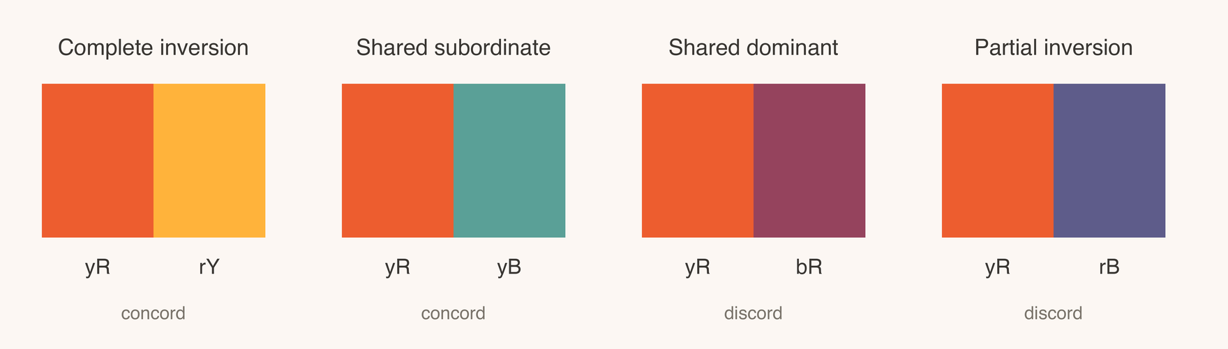
Any two tertiaries share one primary, and its role decides how they behave:
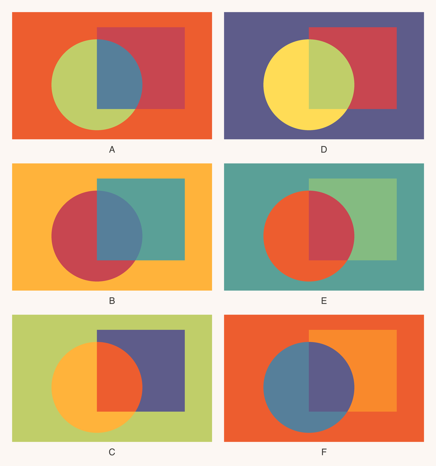
| Pairing | Example | Effect |
|---|---|---|
| Complete inversion | yR + rY | The same two primaries, roles swapped. Both lean toward one secondary: a close bond. |
| Shared subordinate | yR + yB | The same minor color. Together they hold all three primaries equally: complementary, complete. |
| Shared dominant | yR + bR | The same major color pulled two ways: tension and detachment. |
| Partial inversion | yR + rB | All three primaries, one role inverted: the strongest clash. |
The first two are concords, the last two discords. Garau tested these pairings on painted plates for the first half of the book: on what ground a pair holds together, when it splits and joins its neighbors, and how a pair that splits can dismember a figure. A parrot whose plumage is a partial inversion vanishes into flowers and sky.
Garau’s theory: the eye splits color mixtures
The book’s ninth chapter brings the two lines together. Garau’s thesis is blunt: perceptual transparency is founded on visual reality, not on physics. The long argument over whether the overlap color is an additive mixture of light (Heider, Metelli, Da Pos) or a subtractive mixture of filters (Beck, Albers) does not matter to him. What matters is that the overlap color looks like a mixture. The eye splits a visual mixture into its visible components and gives one to the veil and one to the ground.
Several consequences follow, and Garau sets them out as conditions:
- A color that looks pure, a primary yellow, red or blue, cannot be split. Neither can gray into chromatic hues.
- Unbalanced tertiaries split easily; balanced orange, green and violet resist.
- The color the two overlaps share becomes the color of the veil. The colors they do not share go to the ground.
- If the shared color is present in equal amounts in both overlaps, the veil looks even. If not, the ground must absorb the excess.
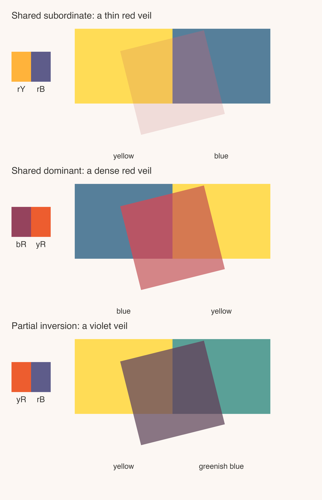
- The role of the shared color sets how transparent the veil looks. Minor in both overlaps: a thin, very transparent veil. Major in both: a dense, nearly opaque one.
So the four pairings become four kinds of veil. Shared subordinate gives
the ideal one: lay rY and rB over yellow and blue, and a thin red veil
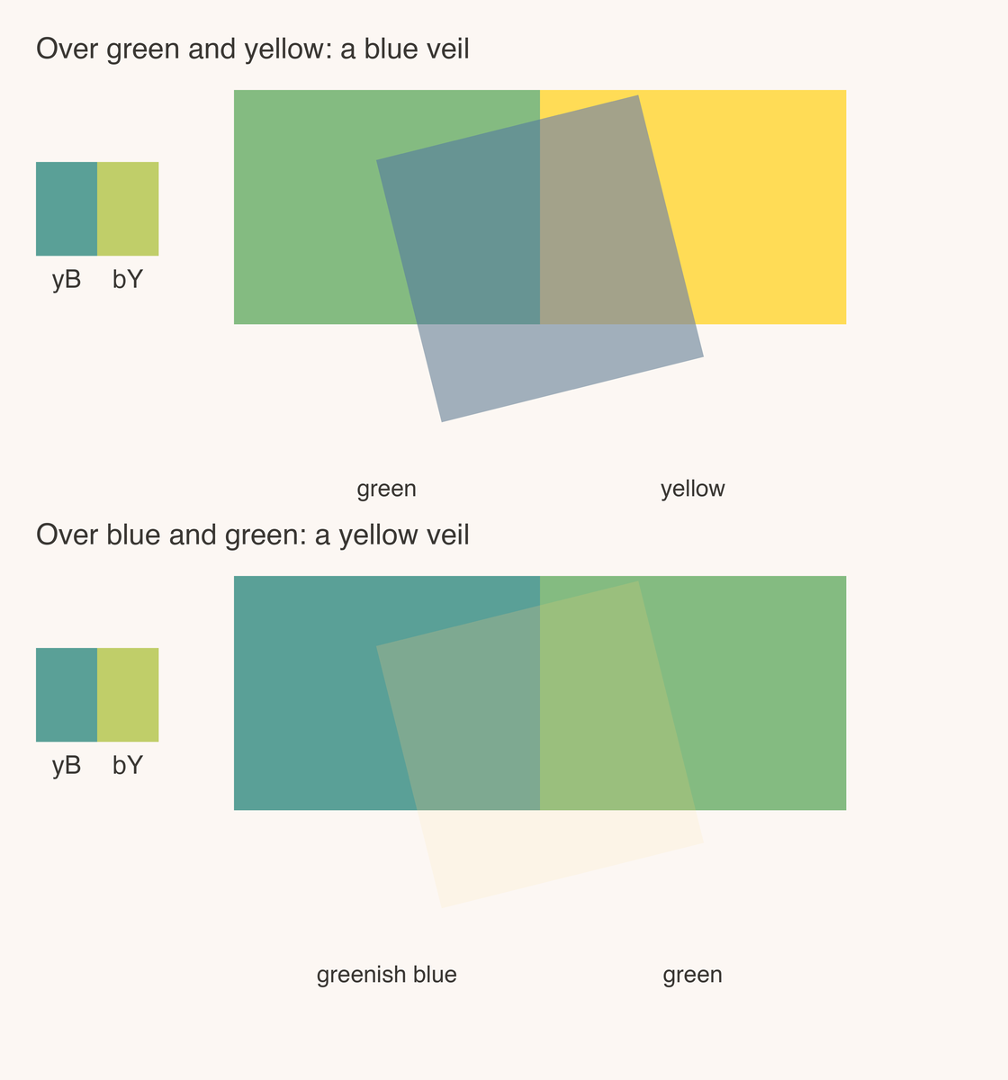
appears. Shared dominant holds together but looks dense. In a complete
inversion the ground chooses the veil: the same yB and bY read as a blue
veil over green and yellow, and as a yellow veil over blue and green.
Partial inversion works only if the ground compensates for its imbalance.
From there Garau goes where science could not follow. Layers can be stacked, each transparent only to the one below. And in his tenth chapter he describes anomalous transparency: inverting the usual roles so that the ground’s minor color absorbs part of the veil. A veil is seen even though the color of the ground cannot be recognized through it. That breaks a rule everyone had assumed.
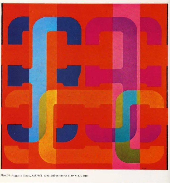
Because the veil is painted, not physical, it can also be absurd. In his 1983 painting Red Field a stripe is transparent in one part and opaque in another, and depth order reverses as you look. Transparency painted in opaque oil follows the logic of seeing, and the logic of seeing allows impossible objects.
Where Garau meets Metelli: hue and the degree of transparency
Garau’s theory is written in color names and Metelli’s in numbers, but they meet at one point. Take one veil over one ground and change only α. When α is high, most of what you see is the ground, and the veil’s color enters each overlap as a minor component: a shared-subordinate pair, which Garau calls very transparent. When α is low, the veil dominates both overlaps: a shared-dominant pair, which he calls nearly opaque.
Garau’s four pairings are not only a grammar of harmony. Read along α, they describe how a veil thickens.
Perceptual transparency research after Garau
One reader took Garau seriously at once. Arnheim, who had advised him on the book, reviewed it in Leonardo in 1987 and summarized its transparency rule plainly: the color the two overlaps share becomes the local color of the veil, and the veil is strongest when that color is the minor one. He approved without reservation; Garau, he wrote, had carried his own pairings into more complex applications.
Vision science went another way and never cited him. Yet three findings from the following decades bear directly on his claims.
Transparency without physics. In 1997 Michael D’Zmura and colleagues showed that shifting the colors of a region in color space, even with no change in luminance, is enough to make it look transparent. No filter and no spinning disk can produce such a display. Garau’s thesis, that the veil belongs to seeing and not to optics, gets its clearest support here.
Shared hue. Testing their model the following year, Chen and D’Zmura found they needed an extra condition: the overlay must share hue with both regions beneath it. That is close to Garau’s rule that the shared color becomes the veil, reached independently, in a different vocabulary.
Additive or not. Falko Faul and Vincent Ekroll showed in 2002 that observers’ best transparencies depart systematically from Metelli’s additive model and follow one that behaves like a filter. They also rejected the idea that the additive conditions are “necessary but not sufficient”, which is, word for word, how Arnheim reports Garau’s position. Their model, unlike Metelli’s, lets a yellow veil over blue come out dark and greenish, the display Garau defended against Da Pos, although they never tested that pair.
Set against this, Garau’s record is unusual. He was right early that transparency does not need a physical cause. His rule on the shared color reappears in later work by people who had not read him. His rule on the degree of transparency is Metelli’s α read in hue terms. And three of his predictions remain untested by anyone: that the overlaps must look like mixtures, that unbalanced tertiaries split more readily than secondaries, and that anomalous transparency exists. They are precise enough to test with an afternoon of observers and a screen.
Garau Armonie: an app for color transparency
To teach the theory I built Garau Armonie (tsevis.github.io/garauarmonie), a studio that runs his rules as code. The Composer sets two grounds, a veil and its α, computes the overlaps with Metelli’s equations, and reads them in Garau’s terms: which pairing they form, whether they share a color, how transparent the veil should look. The Stacker builds multiple veils in the order Garau proposes. The Analyzer places any color on the yellow-red-blue disk and names it in his notation.
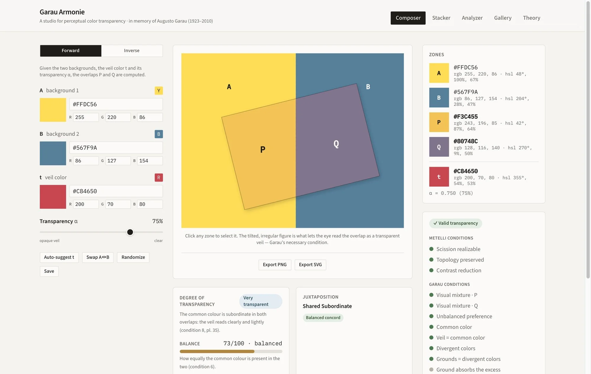
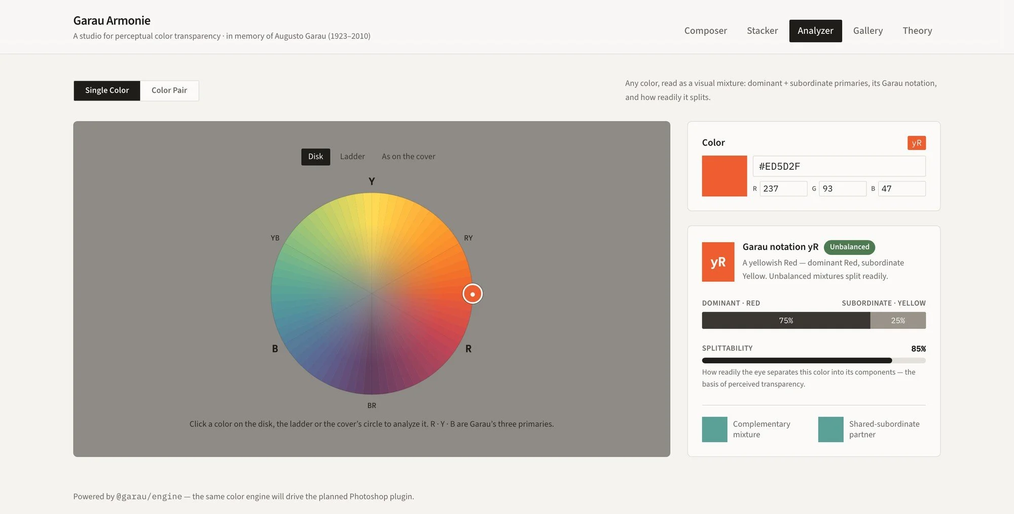
Writing this article meant checking the app against the book, page by page, and correcting it where it had drifted from Garau: it now reads every hue on his yellow-red-blue disk, checks that the veil takes the color the two overlaps share and the grounds the colors they do not, keeps grays out of the hue circle, applies the four pairings to tertiaries only, and computes the overlaps in linear light, as Metelli’s photometric model requires. Garau Armonie is a permanent work in progress: as the theory is tested, the app will follow.
Perceptual transparency in my own work
Garau’s lesson runs through the work I call neofuturistic: the athletes and motion studies for Gatorade, Yahoo!’s London 2012 coverage, Lega Basket Serie A, Royal Mail’s Birmingham 2022 stamps, Ascot, Nordic Global, the Waves of Color series. My teachers in Milan, Nino Di Salvatore with his theory of Gestalt space, Carlo Nangeroni, and Garau, gave me the two halves of that language: the polygons come from Di Salvatore’s perspective space, the colors from what Garau called the chromatic continuum, primaries, secondaries and tertiaries placed so that neighbors bind and the whole surface holds as one.
Perceptual transparency is in all of my work, the mosaics included, not only the neofuturistic pieces. But I rarely use it the realistic way, one veil over one ground. I use it the way the Cubists used planes: so that the eye finds more than one reading and has to choose, then choose again. Garau showed that this is possible with opaque color alone. His Red Field and the reversible veils in the book are depth orders that will not settle, and that instability is exactly what I want from a surface.
Veils
Look at the lens of the cameras I drew as avatars for the new Flickr. A yellow disc lies across the dark rings of the lens, and where the two meet I painted a pale, almost white lens shape. Nothing is translucent; every area is a flat vector fill. Yet the yellow reads as a glint of light lying over the glass, the white as the glass catching it, and the dark ring as the depth behind. Three opaque colors, and the eye builds a layered object out of them.

In Waves of Color, the series my friend Paolo named, the planes are curved instead of cut, and the veils are everywhere. In one study a figure lies back against a yellow field, wrapped in blues. The bands of the hair cross from the yellow ground into the blue of the body, and where they cross they turn olive and green. That is Garau’s disputed case, yellow over blue reading as green, and on the canvas it is simply how the eye wants it: the bands become one strand of color passing over two different grounds.

Time
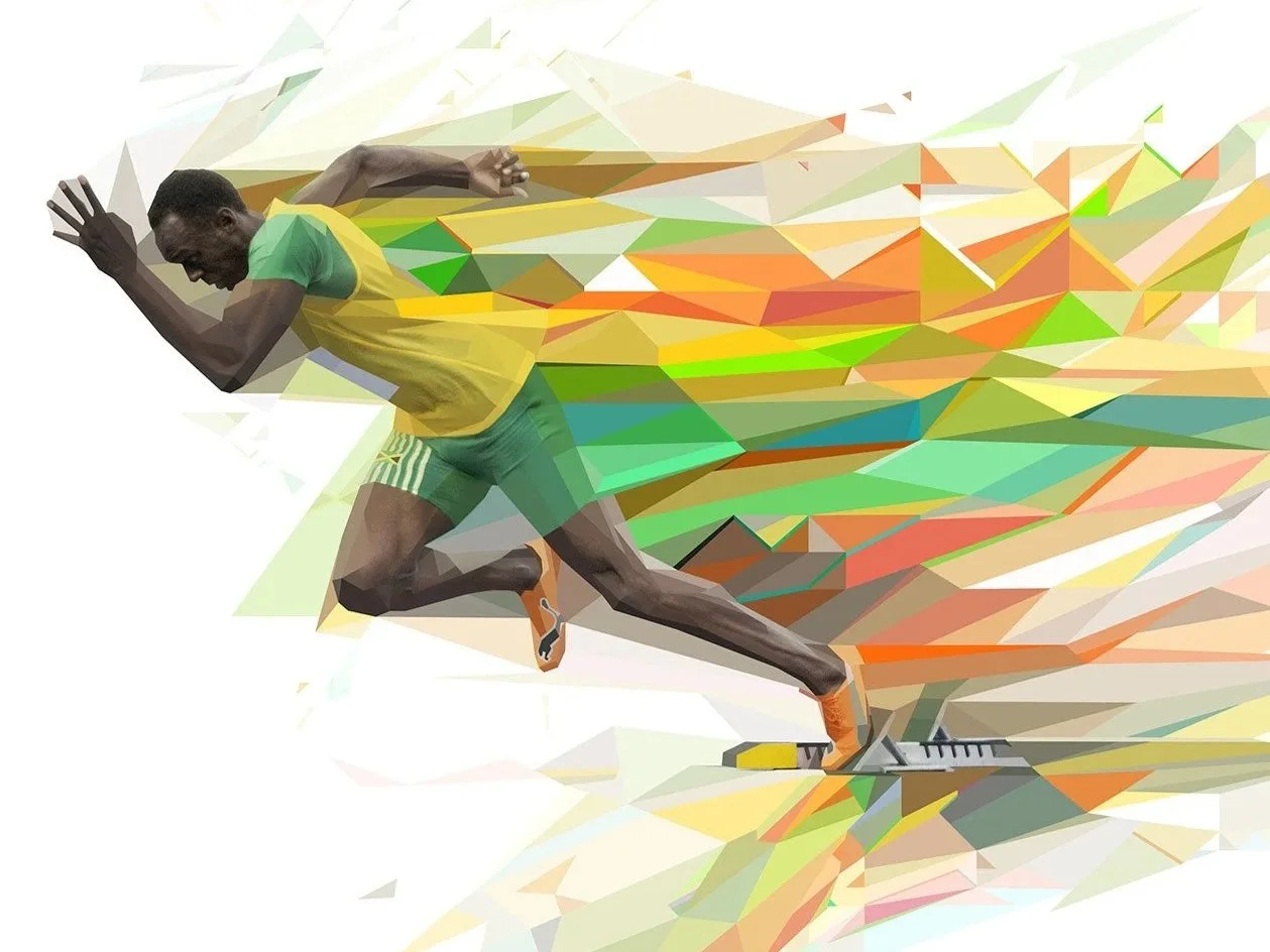
In the Gatorade G Series campaigns a sprinter leaves the blocks and a wake of polygons streams behind him: greens, yellows and oranges that overlap, lighten and fade toward white. Each shard can be read as a veil over the one behind it, and the whole wake as the athlete’s own past positions, stacked. This is where I use transparency for what Futurism wanted and could not quite paint: the third dimension, depth, and the fourth, time.
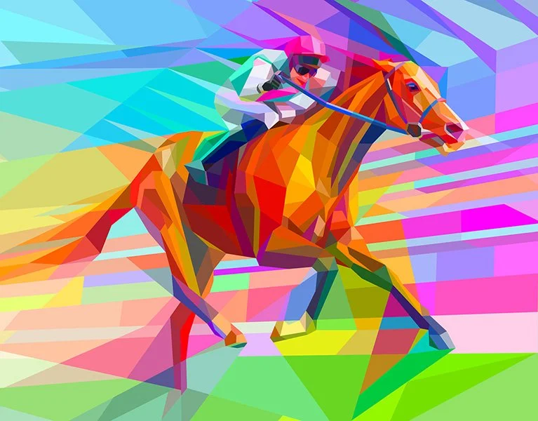
For Ascot’s King George Weekend the brief was “You Bring the Colour”. The racehorse is all oranges, and the field around it is a rush of cyan, magenta, lime and violet streaks that overlap one another and run through the horse’s legs and tail. The streaks are veils over veils; read together they are speed.
Cutting free
The opposite tool matters as much. Where I need an object, or the part of a person that carries the story, to come forward from everything else, I break the harmony on purpose and set colors that do not share what their neighbors share. Garau’s discordant pairings, the ones that refuse to become a veil, are how a hand, a ball or a face is cut free from the surface.
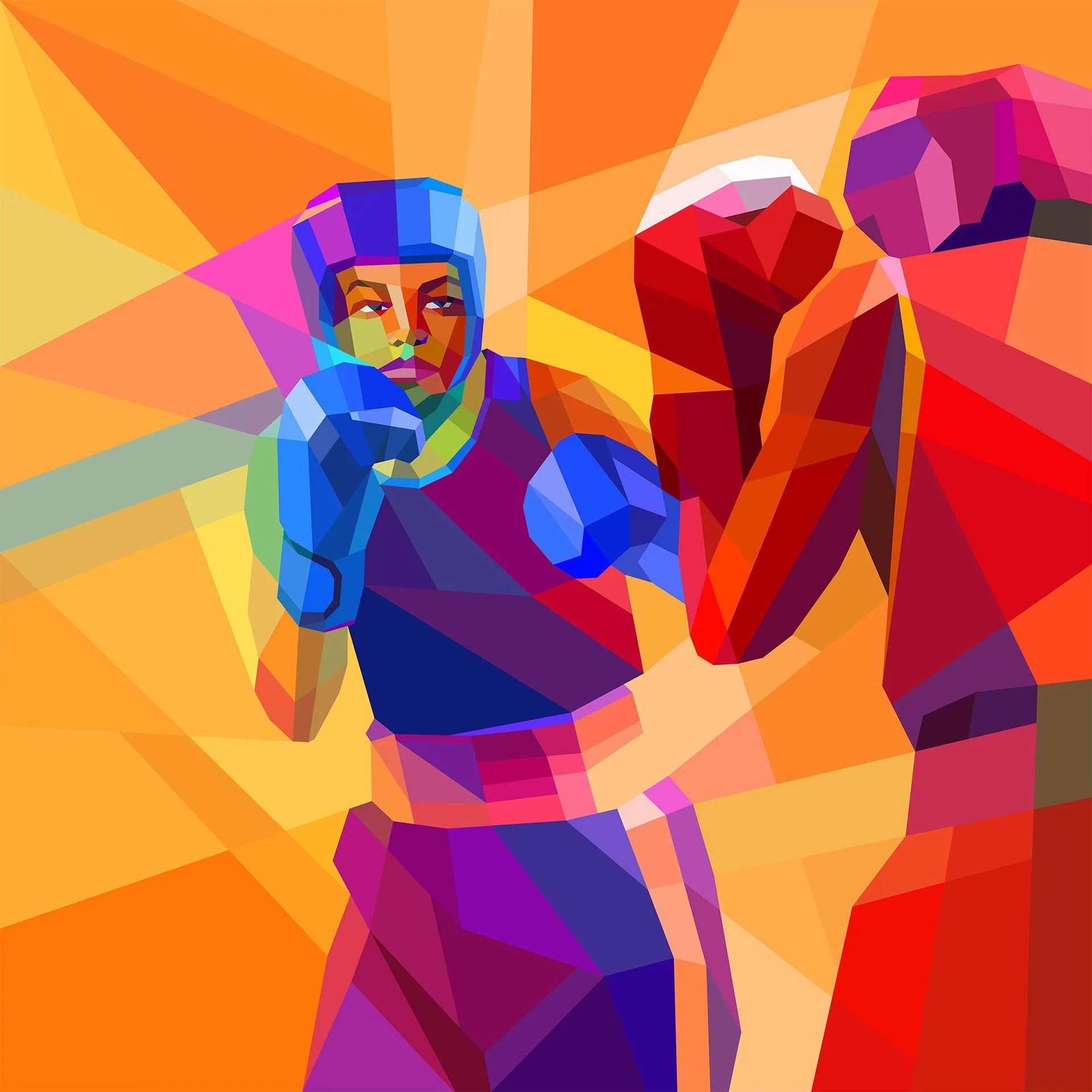
On one of the Royal Mail Birmingham 2022 stamps, the boxing stamp, two boxers face each other on a field of oranges. The opponent is built from reds and stays half inside that warm ground; the boxer in front wears blue, head guard and gloves, and nothing around him shares it. One figure belongs to the surface, the other leaves it.
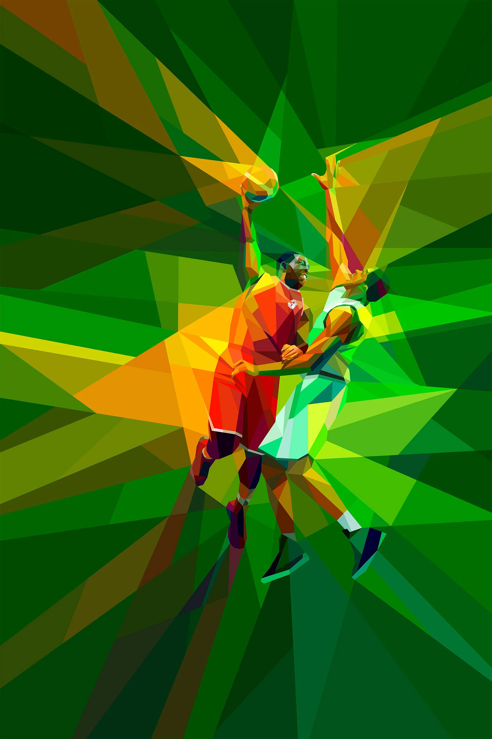
For Lega Basket Serie A, the Final Eight poster set two players in the air inside a burst of greens. The player in red is cut out of that green by its opposite; the player in white and pale green is held half inside it. The ball and the contest sit exactly where the two meet.
The same pairing works at the scale of a face. For Nordic Global, a healthcare technology company, I drew doctors and patients as faceted portraits on green grounds. The faces are built from reds, pinks and corals that bind into one volume, no green enters them, and the head stands clear of the field without a single outline.

That binding, how neighbouring colors hold a figure together, is the other half of Garau’s system. He called it the continuum cromaticum, and it is the subject of part 2 of this series.
Transparency is not a slider
Designers today work almost entirely with flat, opaque color on screens, and transparency is a slider. Garau’s point is that the slider is the least of it. Whether a viewer sees a veil depends on which colors the overlaps share, which they leave out, and what lies around them, and those choices are the designer’s, not the software’s.
Questions
What is perceptual transparency? Seeing one surface through another when nothing is physically transparent. Four flat, opaque colors in two overlapping shapes are enough, if the colors and the shapes meet the right conditions.
Who was Augusto Garau? An Italian painter and color theorist (Bolzano 1923 – Milan 2010), the youngest signatory of the Movimento Arte Concreta manifesto in 1948 and a teacher of color theory and the psychology of form at the Scuola Politecnica di Design in Milan. His book Le armonie del colore (1984) was published in English as Color Harmonies (1993).
What is the difference between Garau’s theory and Metelli’s model? Metelli’s model measures transparency by lightness and gives its degree as α. Garau reads the same displays by hue: which visible colors the overlaps share. For one veil over one ground the two agree: a high α gives a pair that shares a minor color, a low α a pair that shares a major one.
Can a painter use perceptual transparency without software? Yes. Garau painted every plate of his book, and his own canvases, in opaque color. The rules are about which colors to place where, not about tools.
References
- Arnheim, R. (1954). Art and Visual Perception. University of California Press.
- Arnheim, R. (1987). Progress in color composition. Leonardo 20(2), 165–168. doi:10.2307/1578333
- Chen, V. J., & D’Zmura, M. (1998). Test of a convergence model for color transparency perception. Perception 27(5), 595–608. doi:10.1068/p270595
- D’Zmura, M., Colantoni, P., Knoblauch, K., & Laget, B. (1997). Color transparency. Perception 26(4), 471–492. doi:10.1068/p260471
- Faul, F., & Ekroll, V. (2002). Psychophysical model of chromatic perceptual transparency based on substractive [sic] color mixture. JOSA A 19(6), 1084–1095. doi:10.1364/JOSAA.19.001084
- Garau, A. (1984). Le armonie del colore, preface by R. Arnheim. Feltrinelli. English: Color Harmonies, trans. N. Bruno, foreword R. Arnheim, University of Chicago Press, 1993.
- Kanizsa, G. (1955). Condizioni ed effetti della trasparenza fenomenica. Rivista di Psicologia 69, 3–19.
- Metelli, F. (1974). The perception of transparency. Scientific American 230(4), 90–98.